An online platform to learn digital design tools collaboratively
Improving skills takes time and effort. Even with plenty of online resources, going through the process alone can make it hard to stay on track.
To empower individuals to improve their skills by fostering a collaborative and supportive online learning environment.
Discover
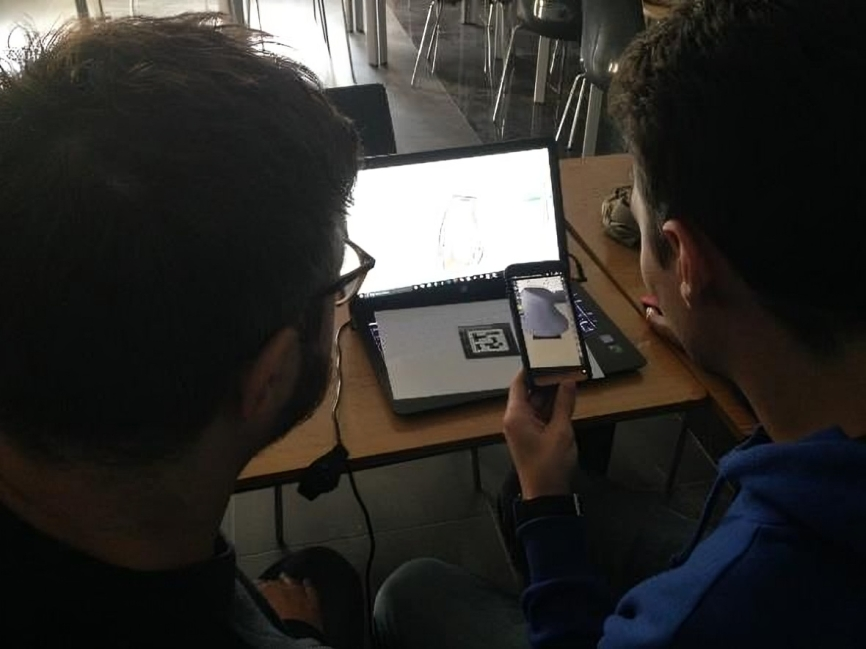
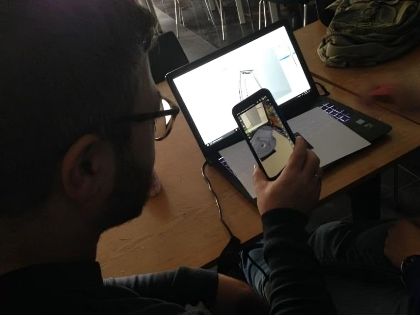
During my Bachelor’s, I noticed in a 3D modeling course that everyone struggled much more when working alone than when we collaborated. This realization inspired me to write my thesis on the topic.
Over the years, through my education and by studying how design and software are taught, I’ve worked to organize my thoughts, spot patterns, and draw valuable connections and insights.
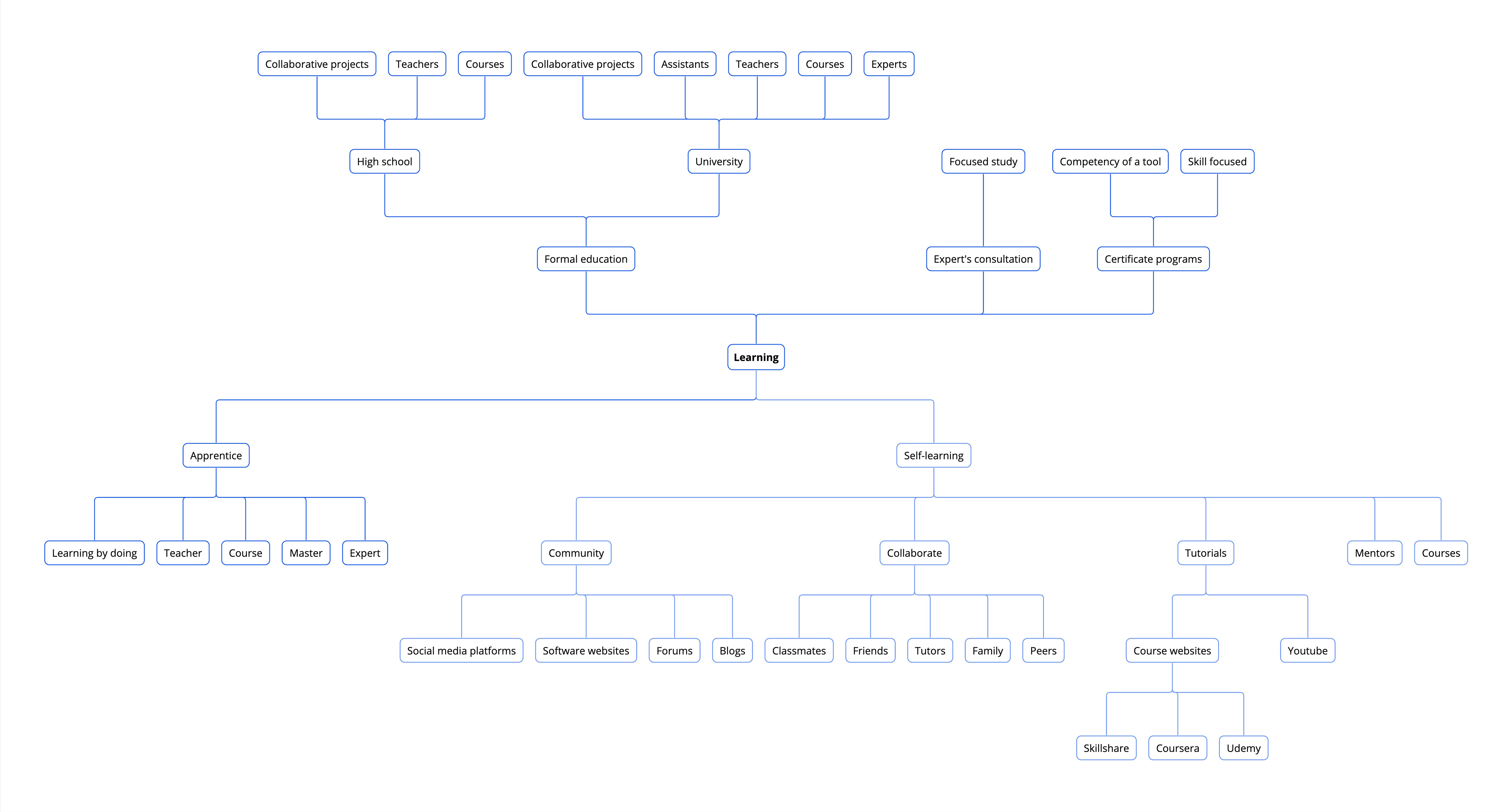
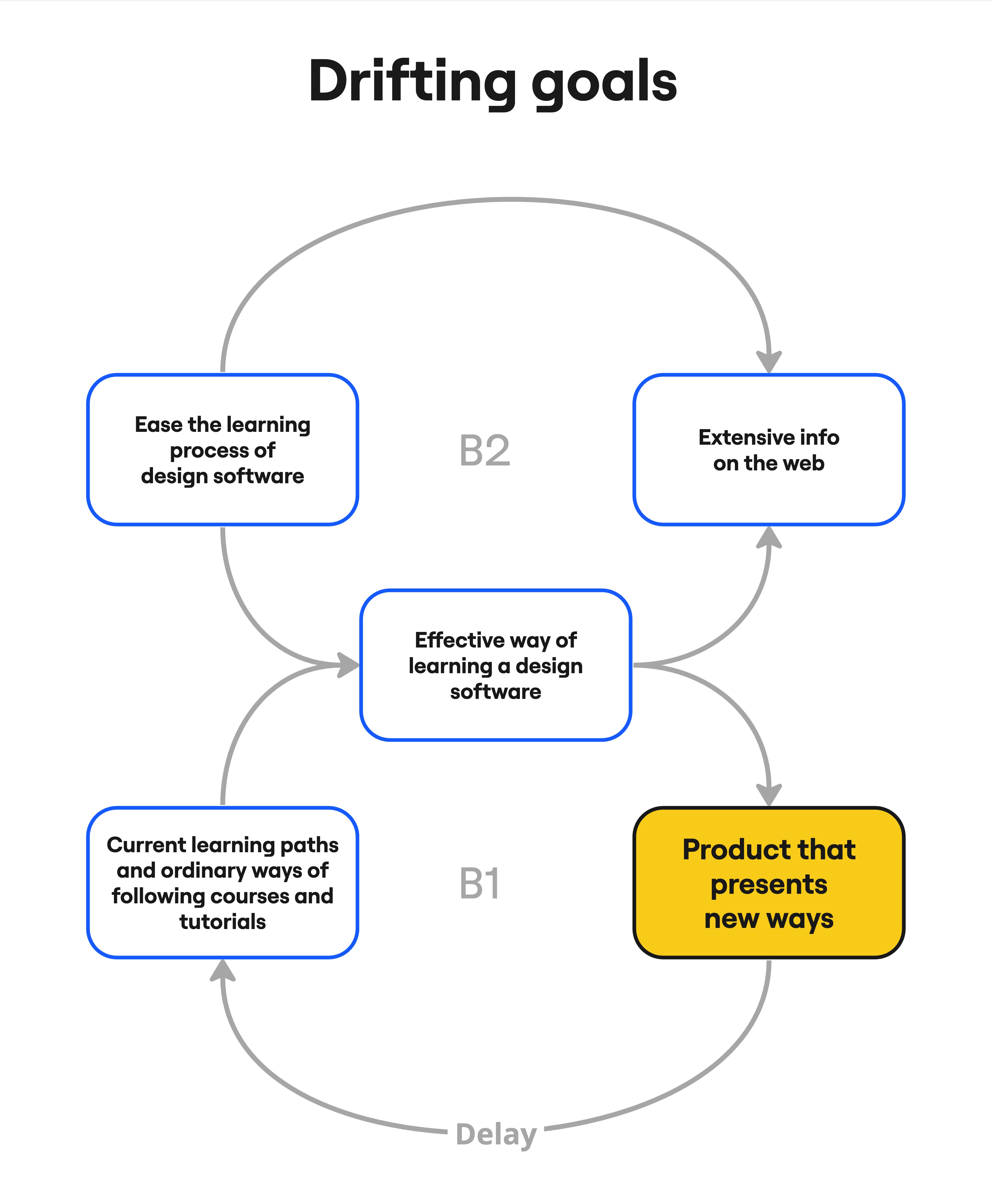
To shape the focus of my thesis, I conducted a literature review to see if recent research matched my ideas. After exploring studies on design software learners in different countries, I defined my research question and used archetypes and causal loop diagrams to guide my approach.
Alongside exploring the research question, I also focused on integrating pedagogical insights. A key concept was Lev Vygotsky’s Zone of Proximal Development (ZPD), which provided valuable guidance for building the foundation of my thesis. This theory outlines three main groups of abilities within its framework.
individually?
with help?
reach.
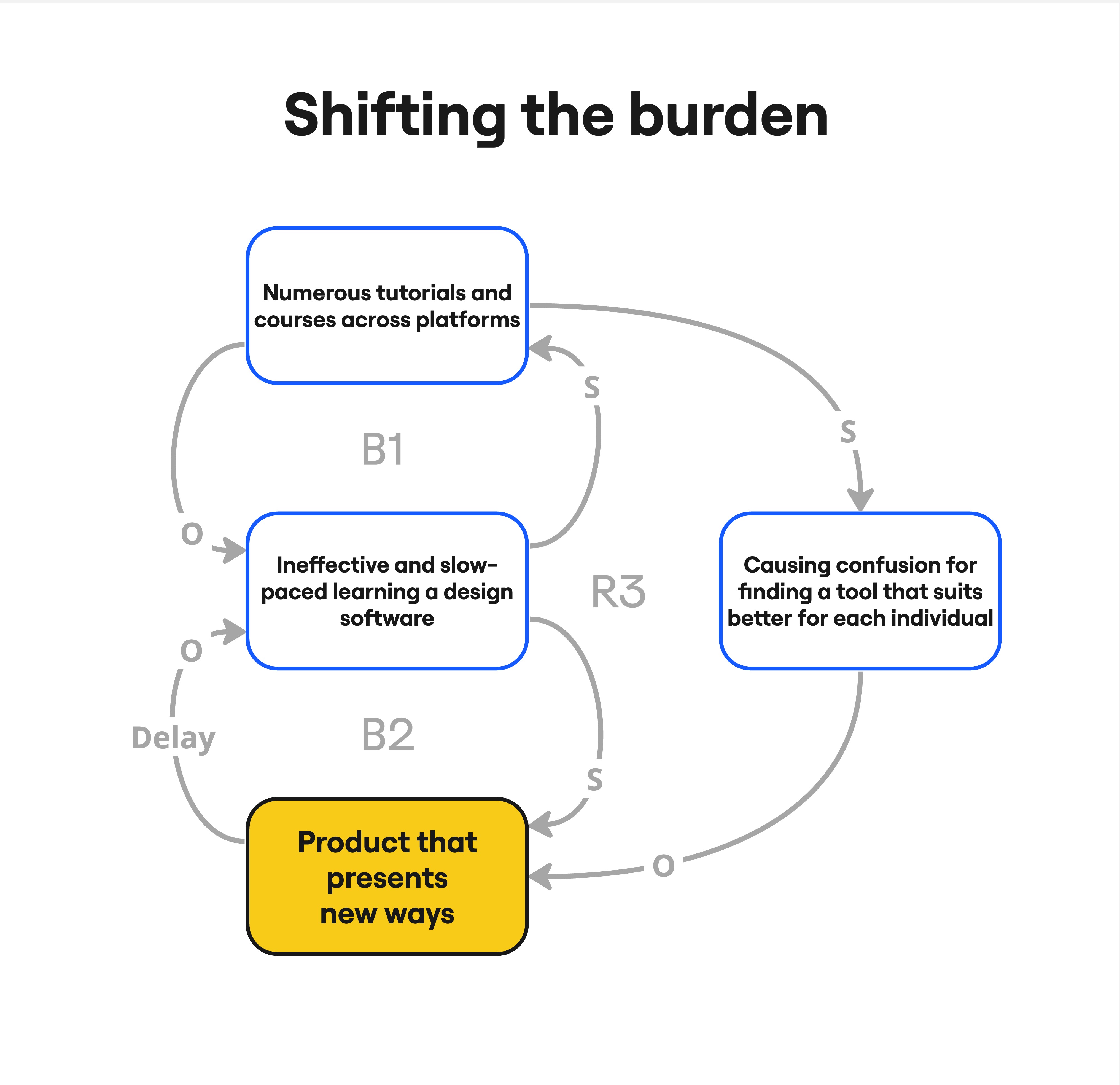
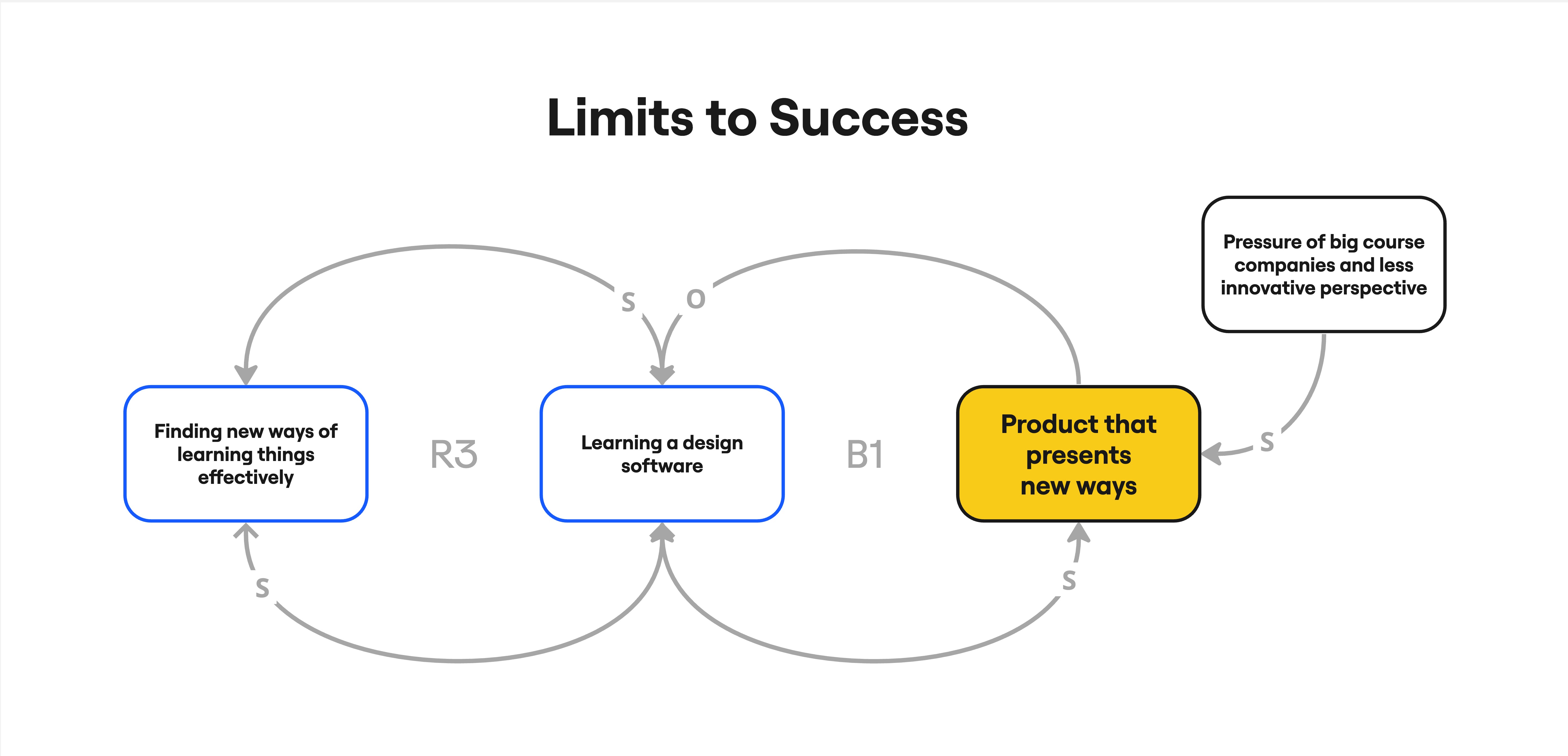
- Generic methods for learning new skills often don’t work for most people.
- The sheer number of tutorials and courses makes it hard for people to find one that fits their specific needs.
- Working in groups greatly motivates people who want to improve their abilities.
- When improving a skill, facing problems often requires proper help from experts.
- Group work can sometimes lead to confusion, especially when the area for improvement isn’t clear or well defined.
How might we empower the experience of seeking and learning a design software?
How might we empower the experience of seeking and learning a design software?
After recruiting participants who regularly use and learn design software, I sent out a survey to gather insights. They shared and rated their past and current experiences. Here are the four key highlights from the survey:
View the survey document
assistance
software use

university projects

not enough
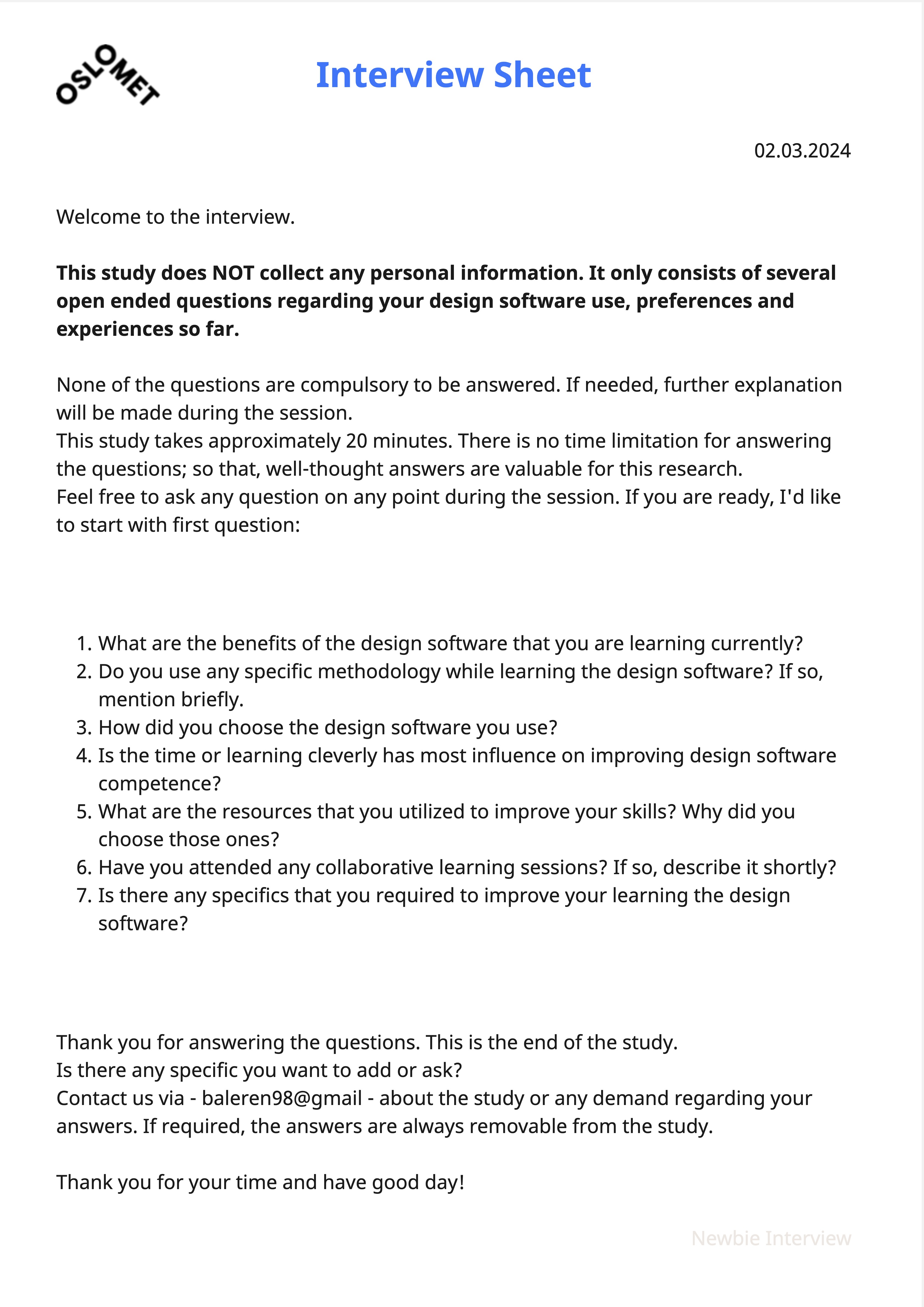
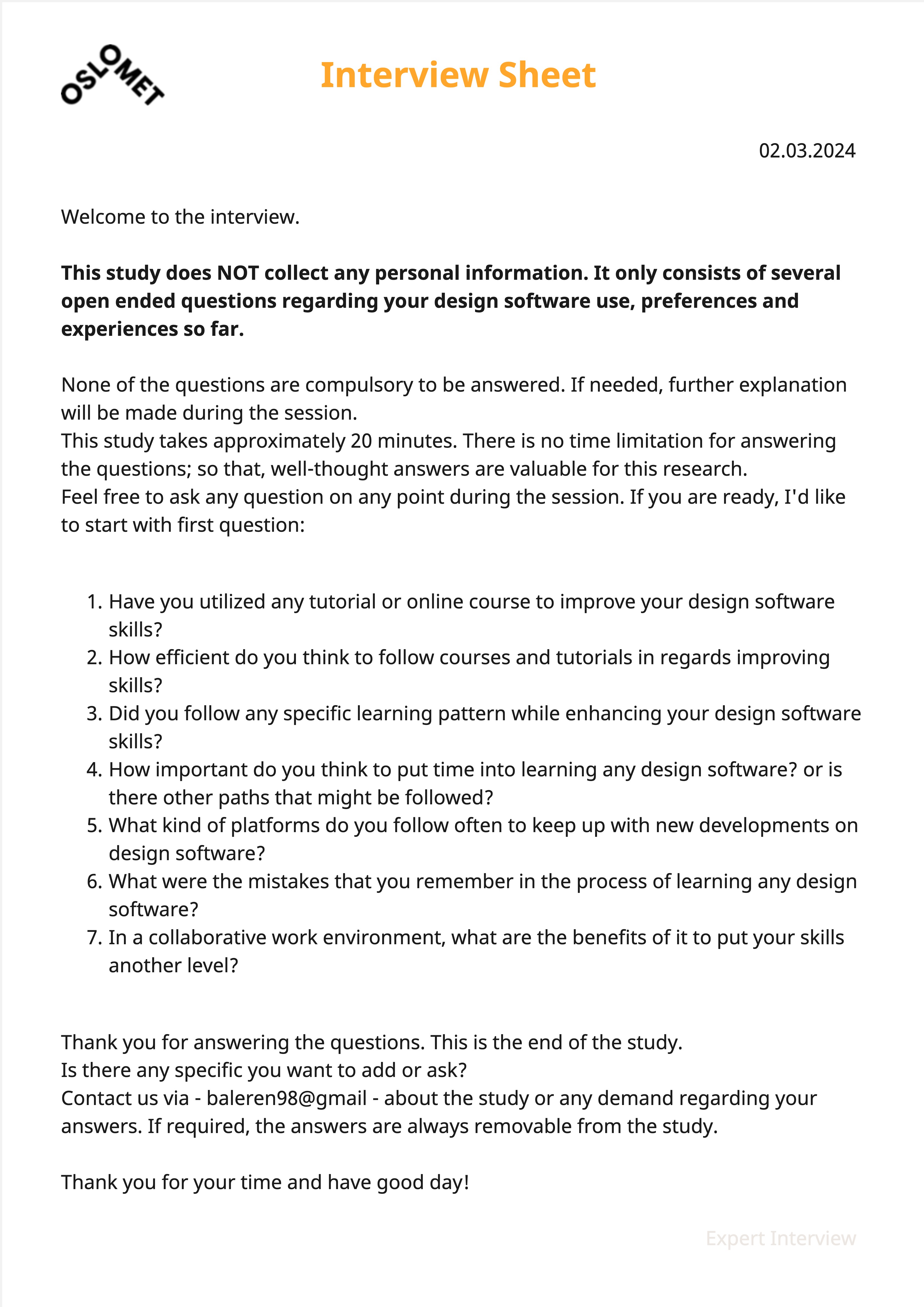
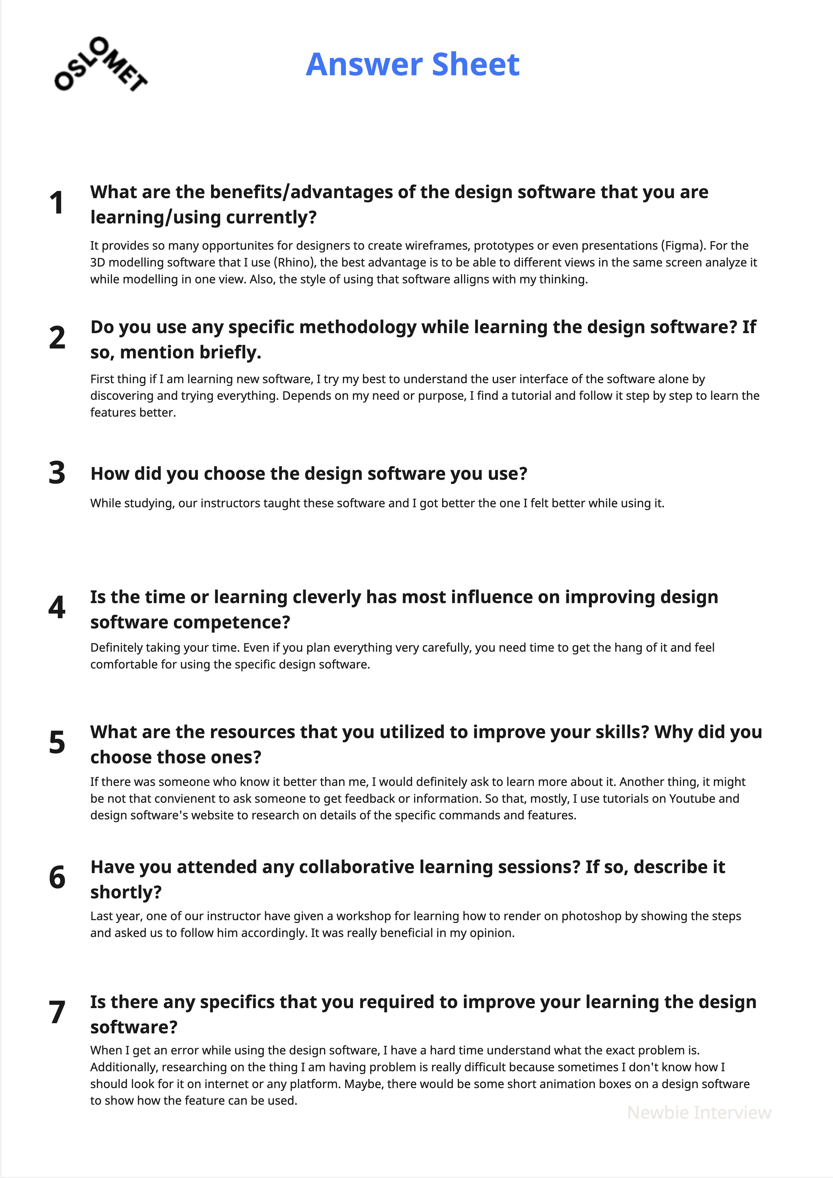
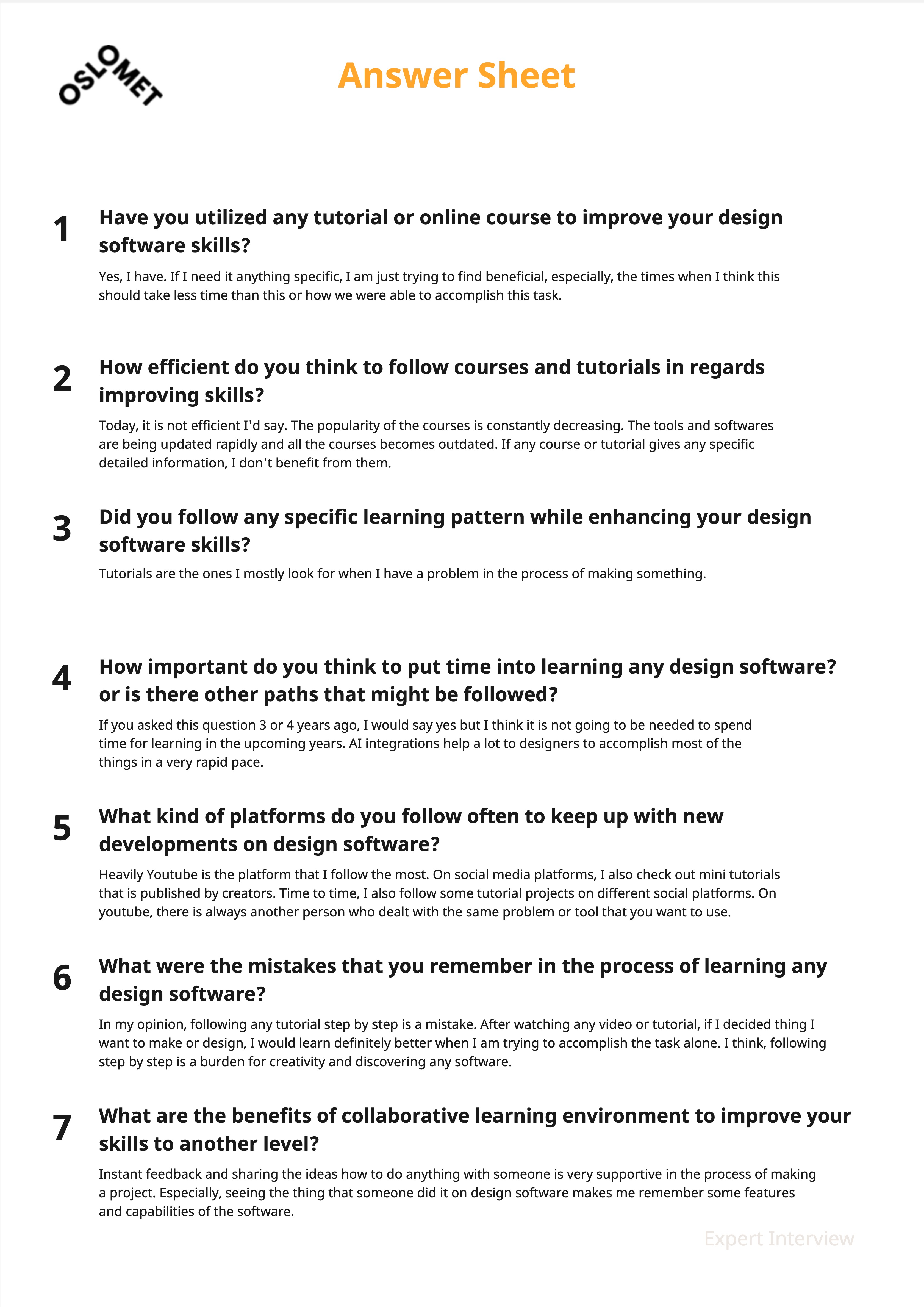
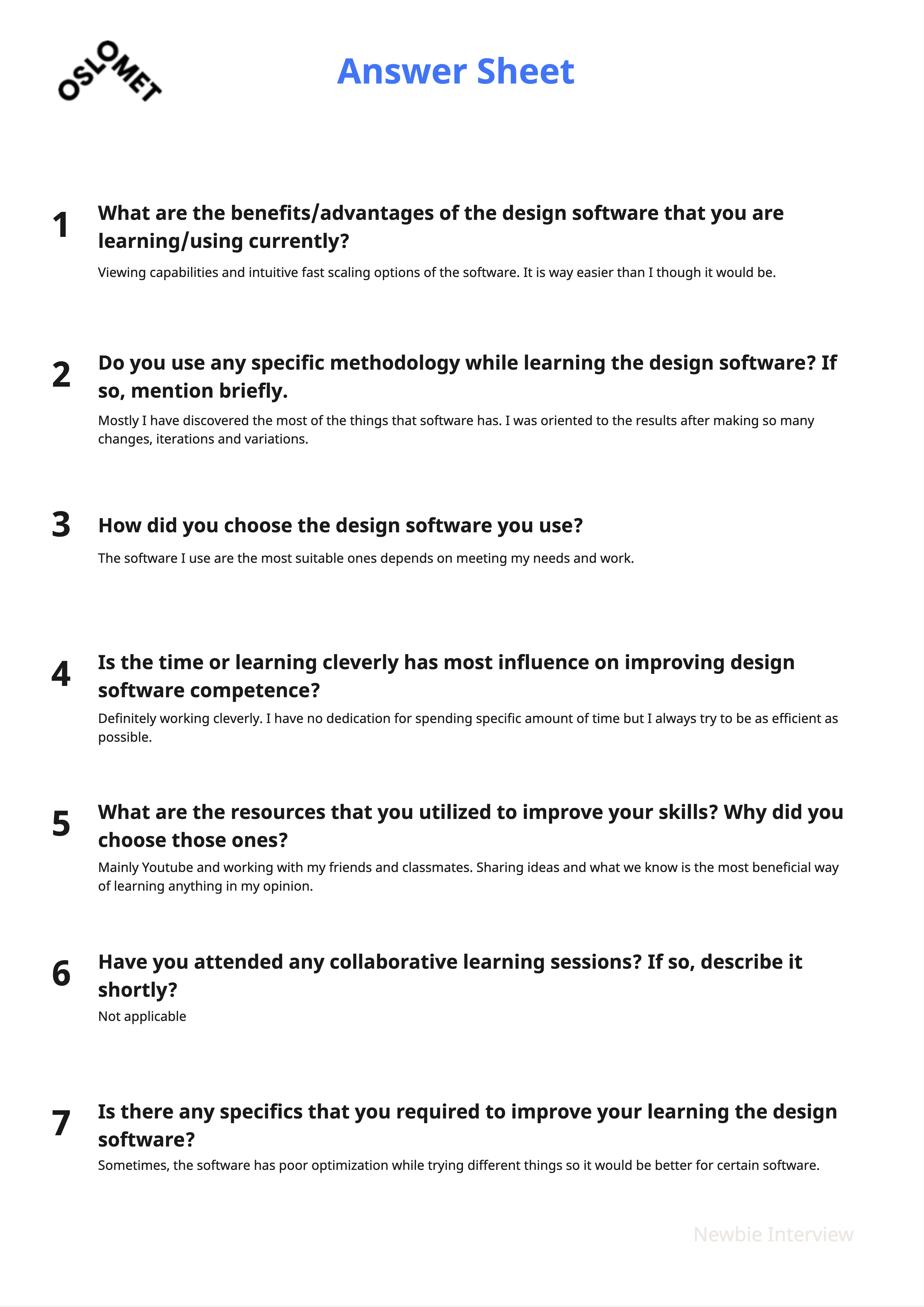
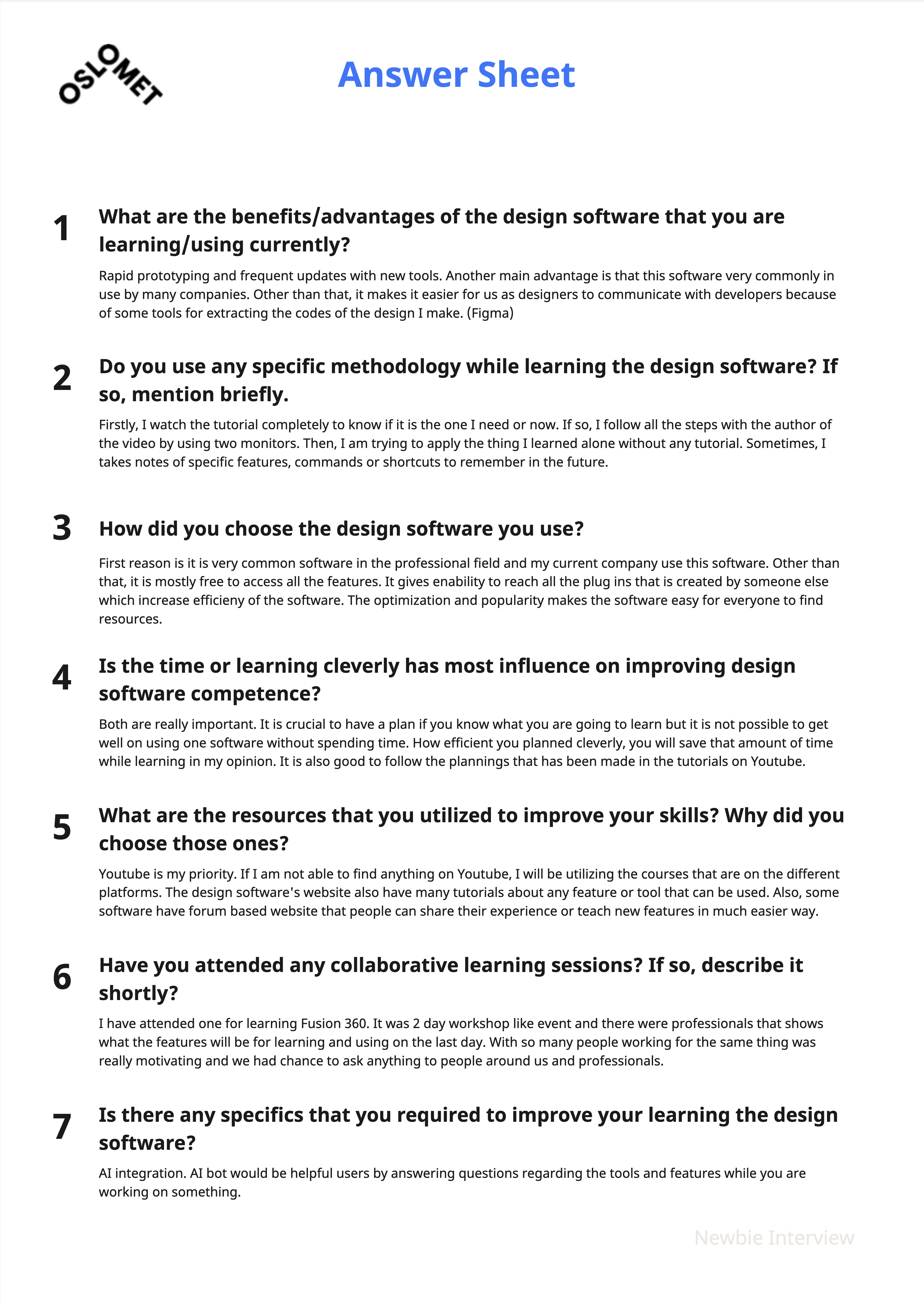
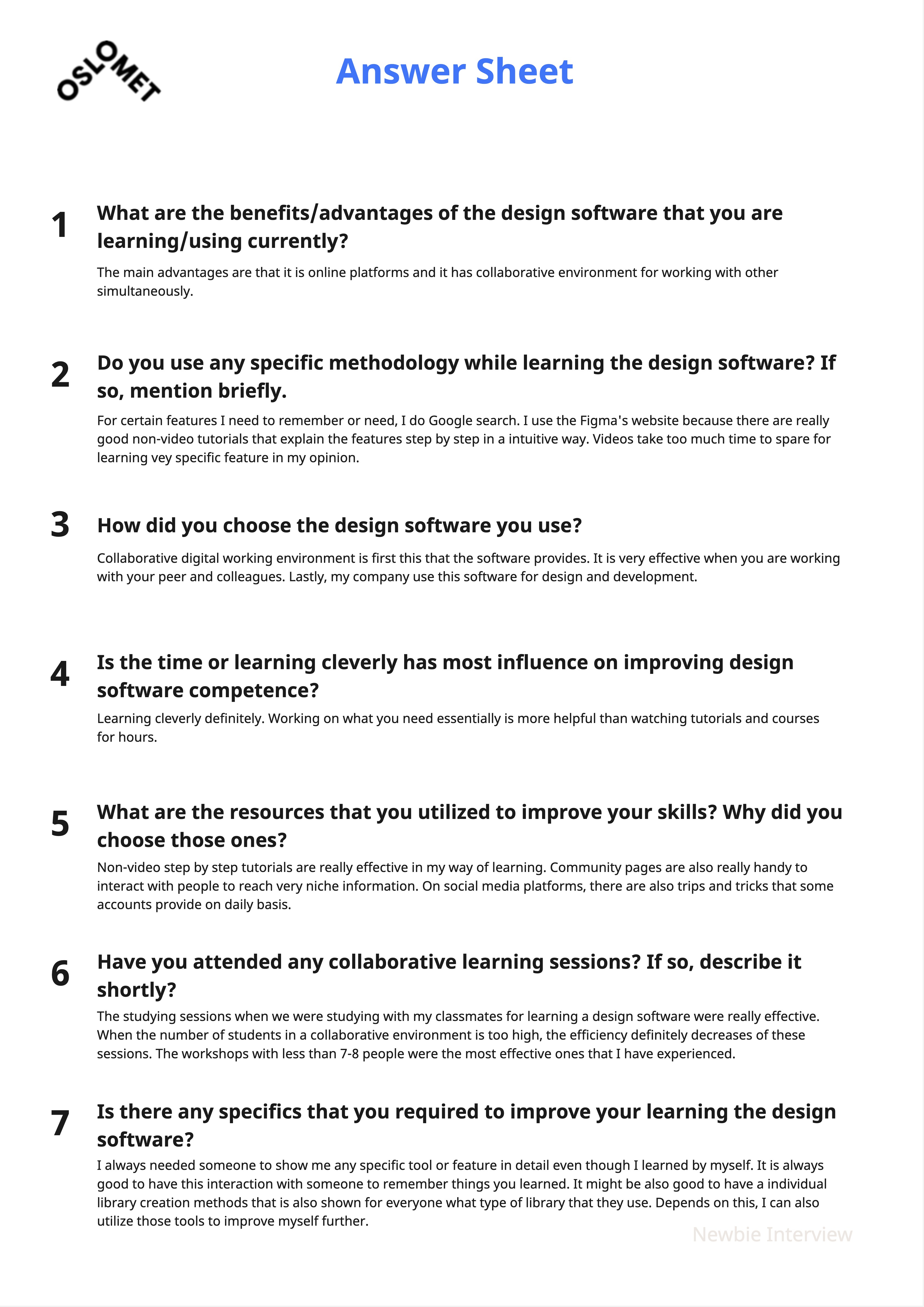
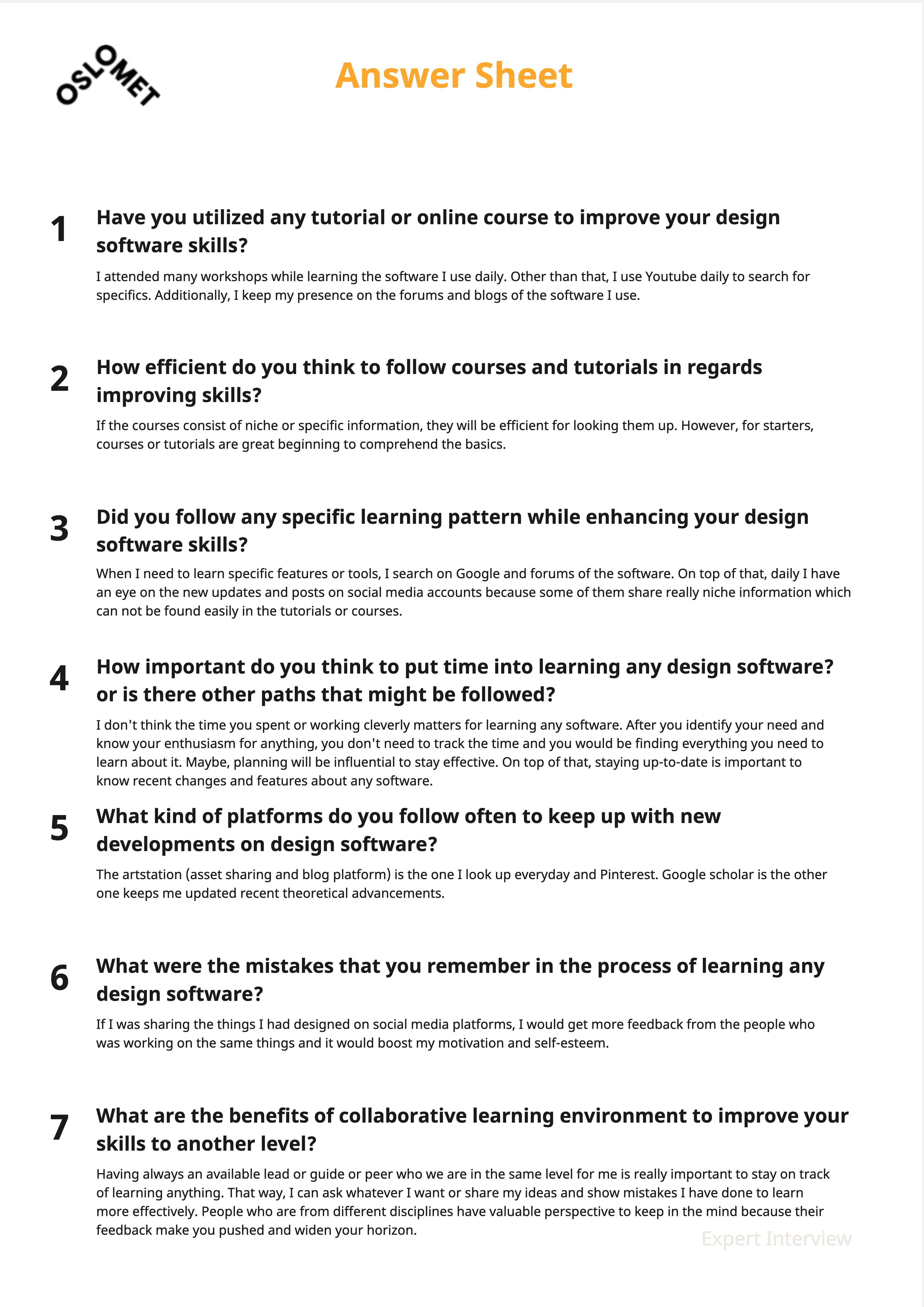
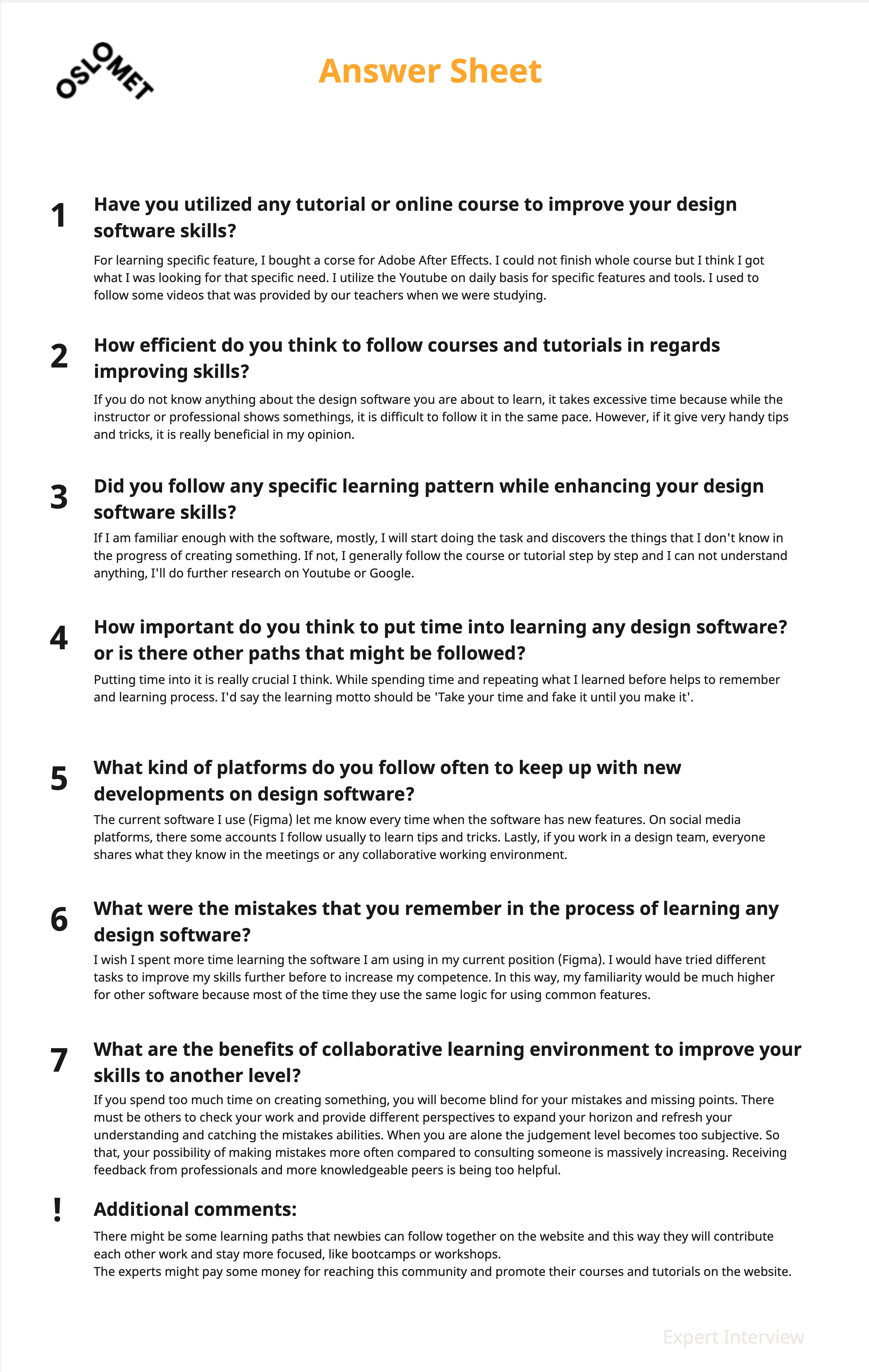
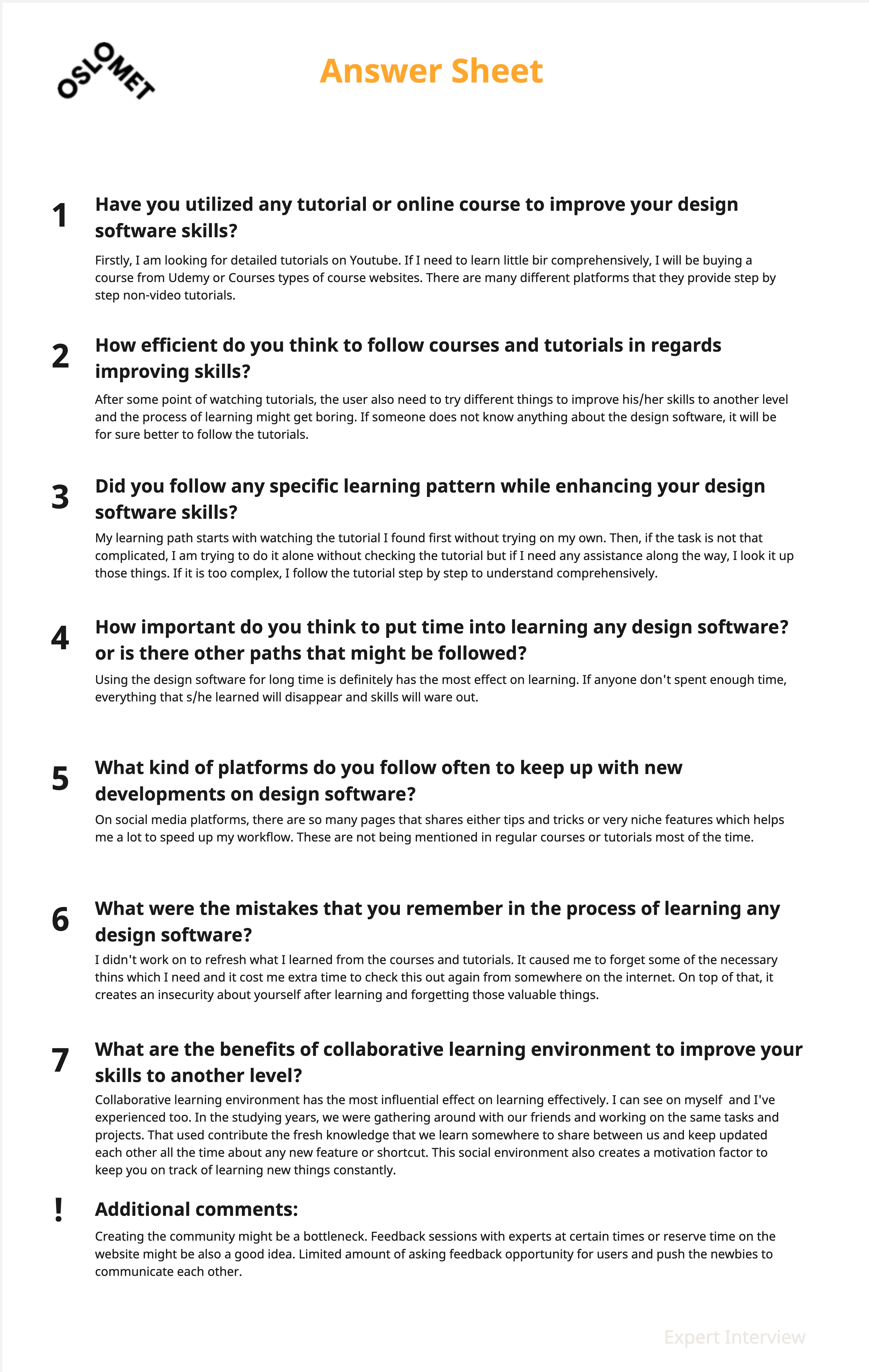
I conducted interviews with both experts and beginners, each bringing different experiences with design software. The questions for each group were customized to explore their specific needs and challenges. Here are the main highlights from each group:
Key Feedback
Learner
“Collaborative digital environments are my top choice for improving. Working with peers and colleagues is definitely more effective.”
Expert
“I attended many workshops while learning the software I use daily. The popularity of courses, however, is constantly decreasing.”

- Learners need real time feedback not just step by step guides so I will embed inline comment threads.
- Many users prefer multiple specialized tools over one bulky app so I will offer quick link switches between utilities.
- Collaborative projects drive stronger outcomes so I will include shared whiteboard sessions and peer groups.
- Tutorials alone are not enough so I will add user rating and tip overlays for each feature.
- Interviews confirm that working with peers boosts motivation so I will highlight active collaborators in the workspace.
- Experts report course fatigue so I will break lessons into bite size modules with optional live drop in events.
Based on these findings I will blend guided tutorials with social learning features so users get feedback advice and collaboration all in one place.
Based on these findings I will blend guided tutorials with social learning features so users get feedback advice and collaboration all in one place.
Empathize
Based on my research, interviews, and surveys, I developed two distinct personas for each user group. Both play a key role in shaping the web platform’s environment.

- Being alone while building skills and trying to stay on track.
- Overwhelming and unorganized information online.
- Having a community or friends who share the same journey.
- Getting constant feedback from peers and friends.

- Finding the right interaction in the right place.
- High competition when marketing materials.
- Sharing knowledge and building new skills through interaction.
- Promoting newly published tutorials and guides.
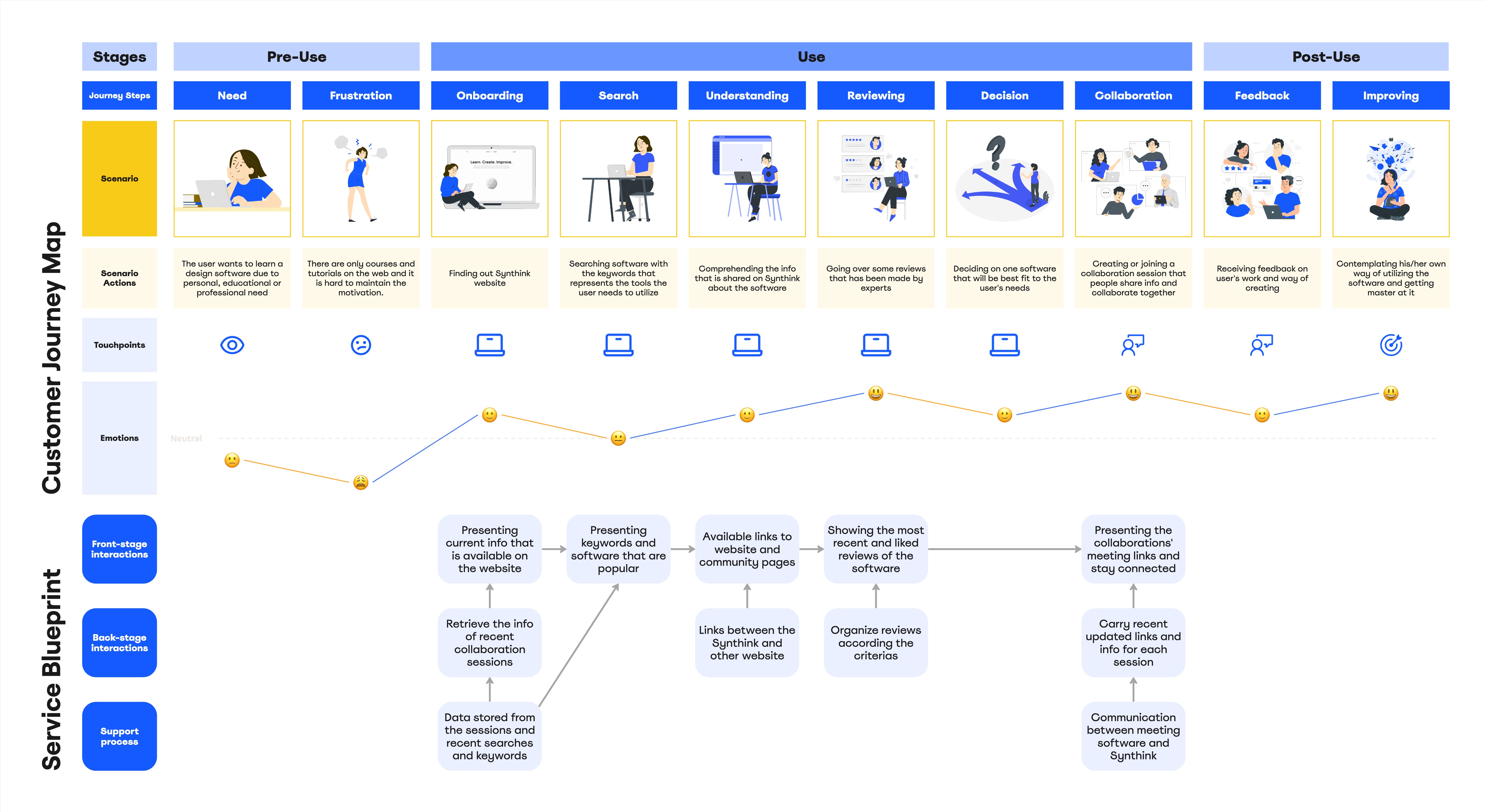
After thoroughly investigating the problem and considering earlier findings, a draft journey map was created to outline the user steps.
- Isak feels isolated when learning solo and needs community motivation.
- Björn thrives on sharing expertise but lacks a dedicated channel to mentor.
- Scattered online resources overwhelm newcomers and lead to drop-off.
- The draft journey map highlights key emotional highs and lows in the UX flow.
Enabling peer-driven support bridges both novice motivation and expert engagement, creating a more resilient learning journey.
Enabling peer-driven support bridges both novice motivation and expert engagement, creating a more resilient learning journey.
Ideate
After synthesizing all the data and narrowing down the key points, I started sketching ideas in eight frames. This approach was helpful for exploring different directions for the product.


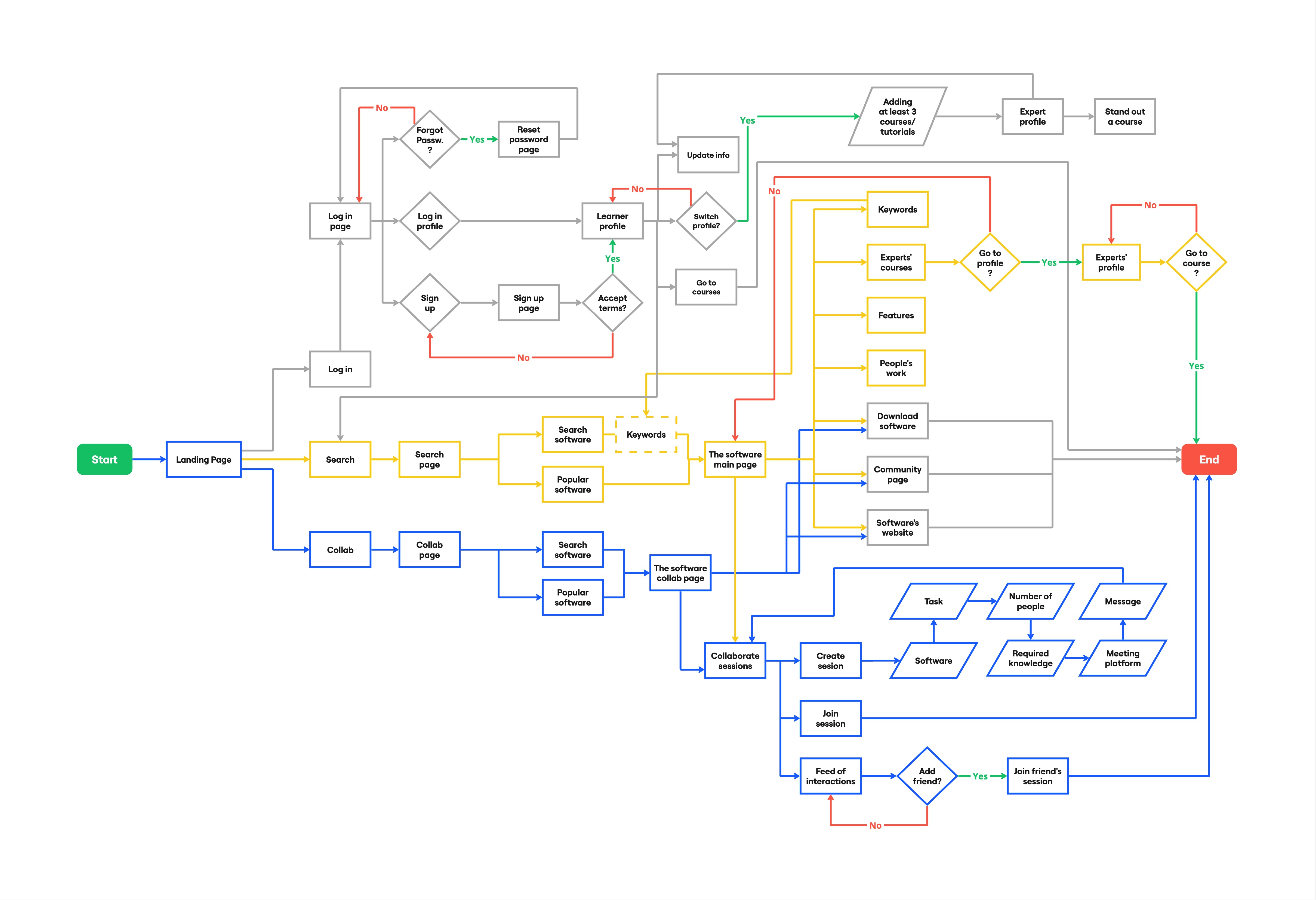
I conducted a personal card sorting activity and, based on the results, developed an information architecture that matches the needs of the target users.
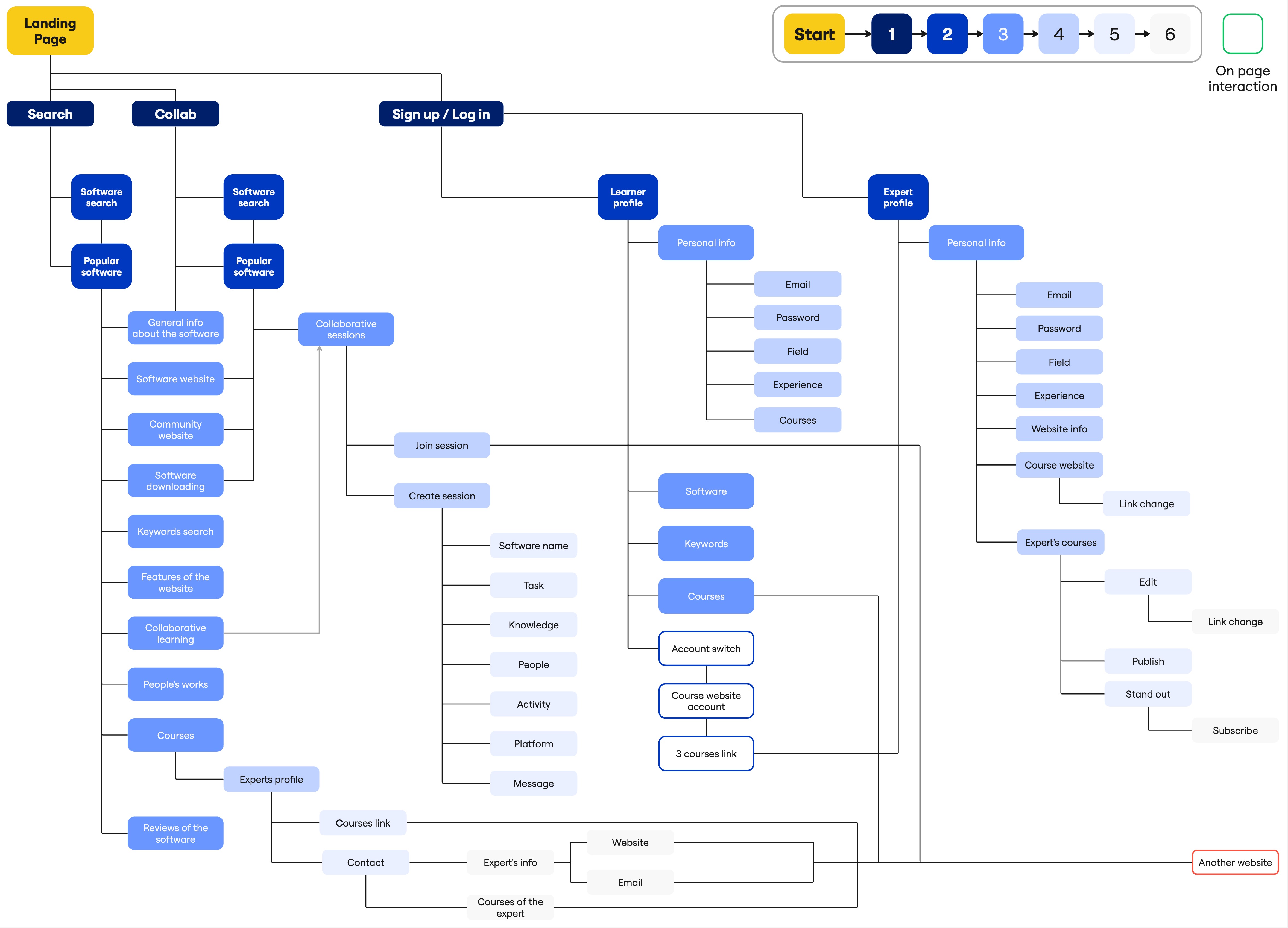
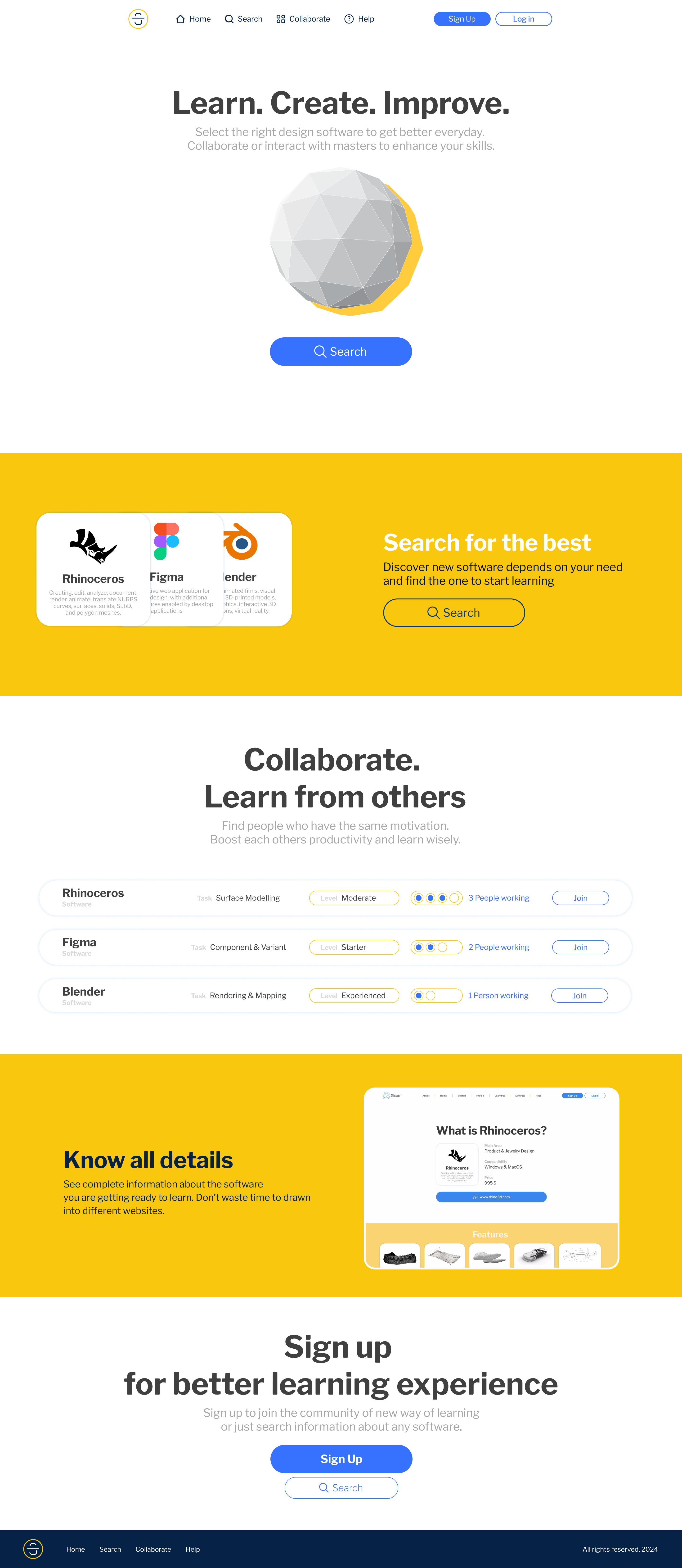
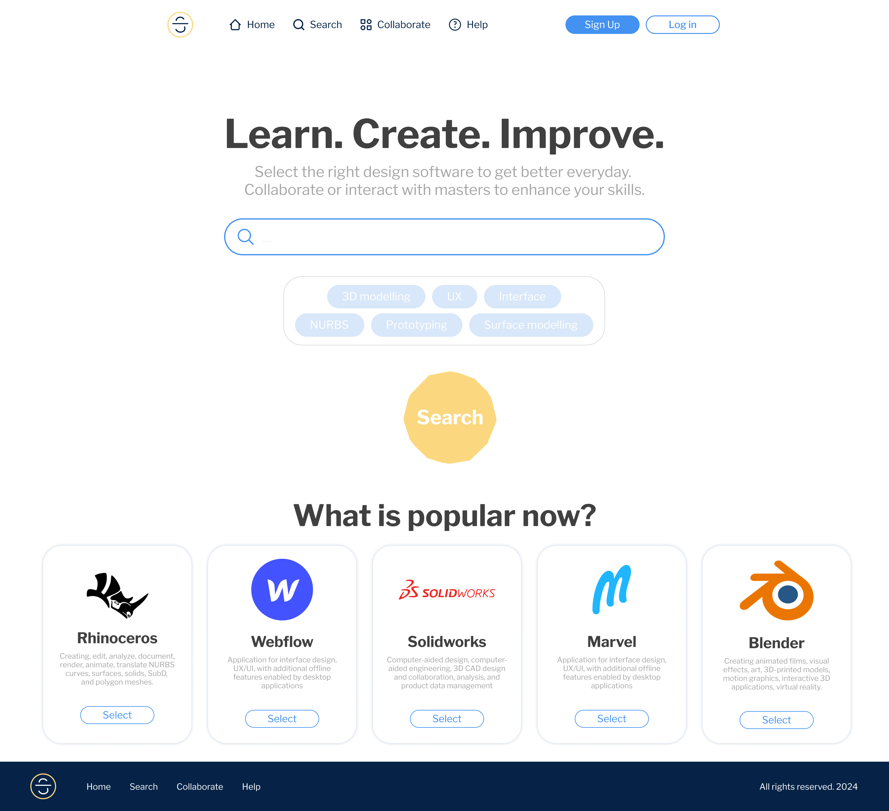
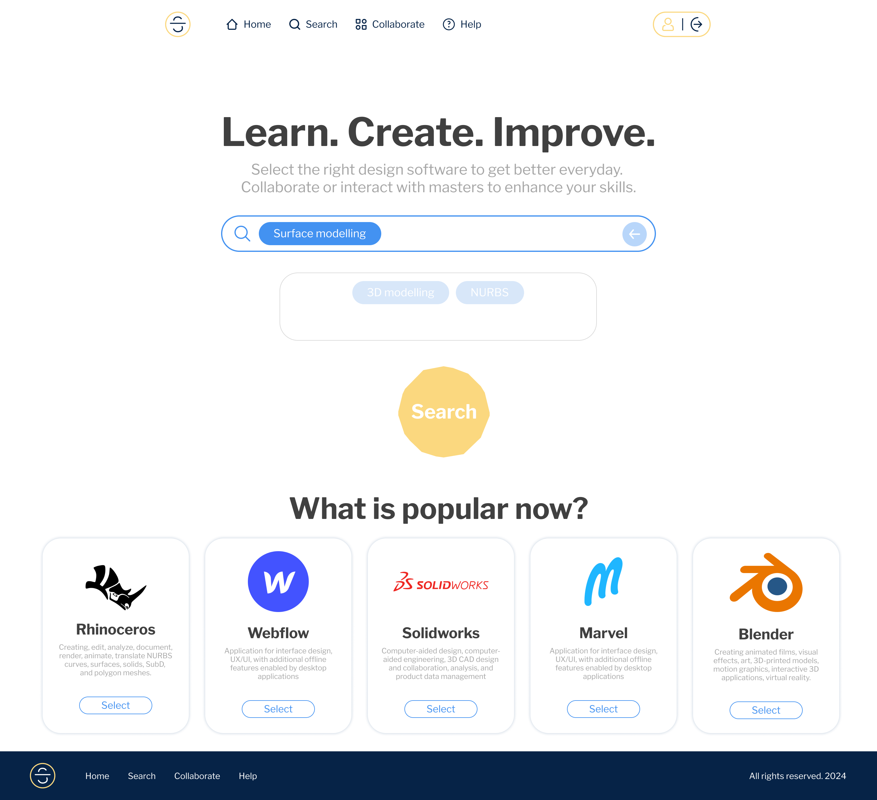
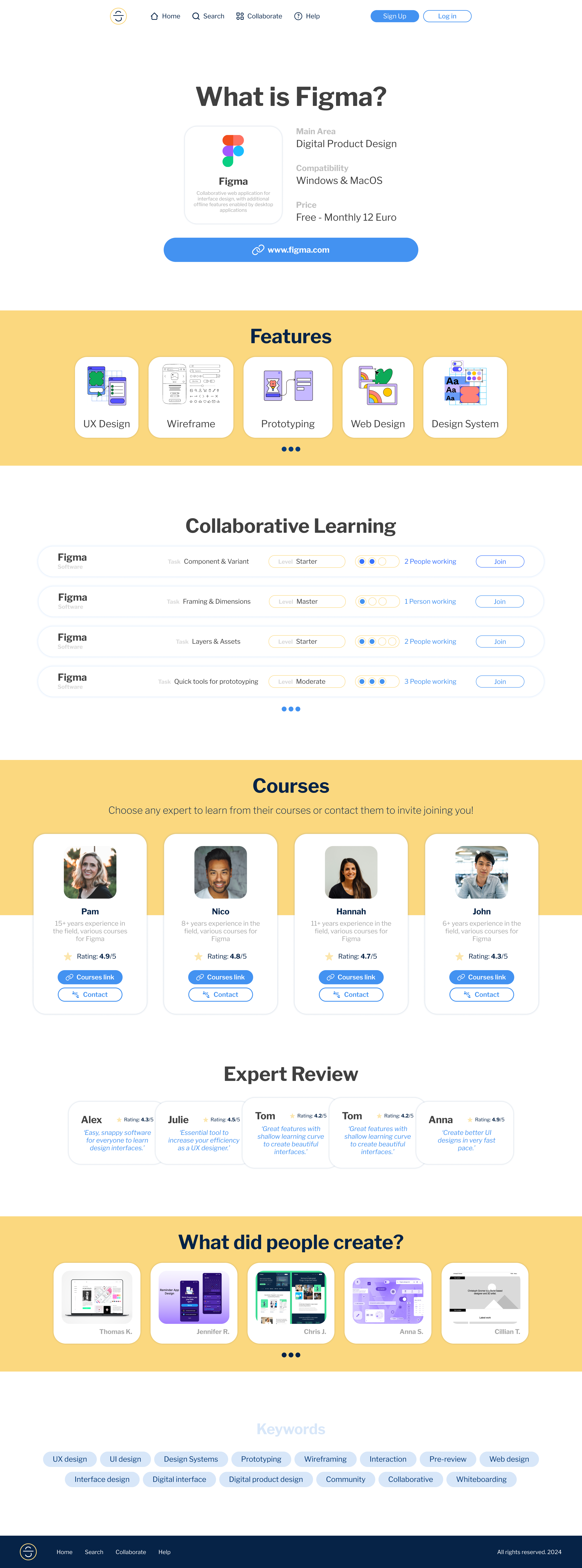
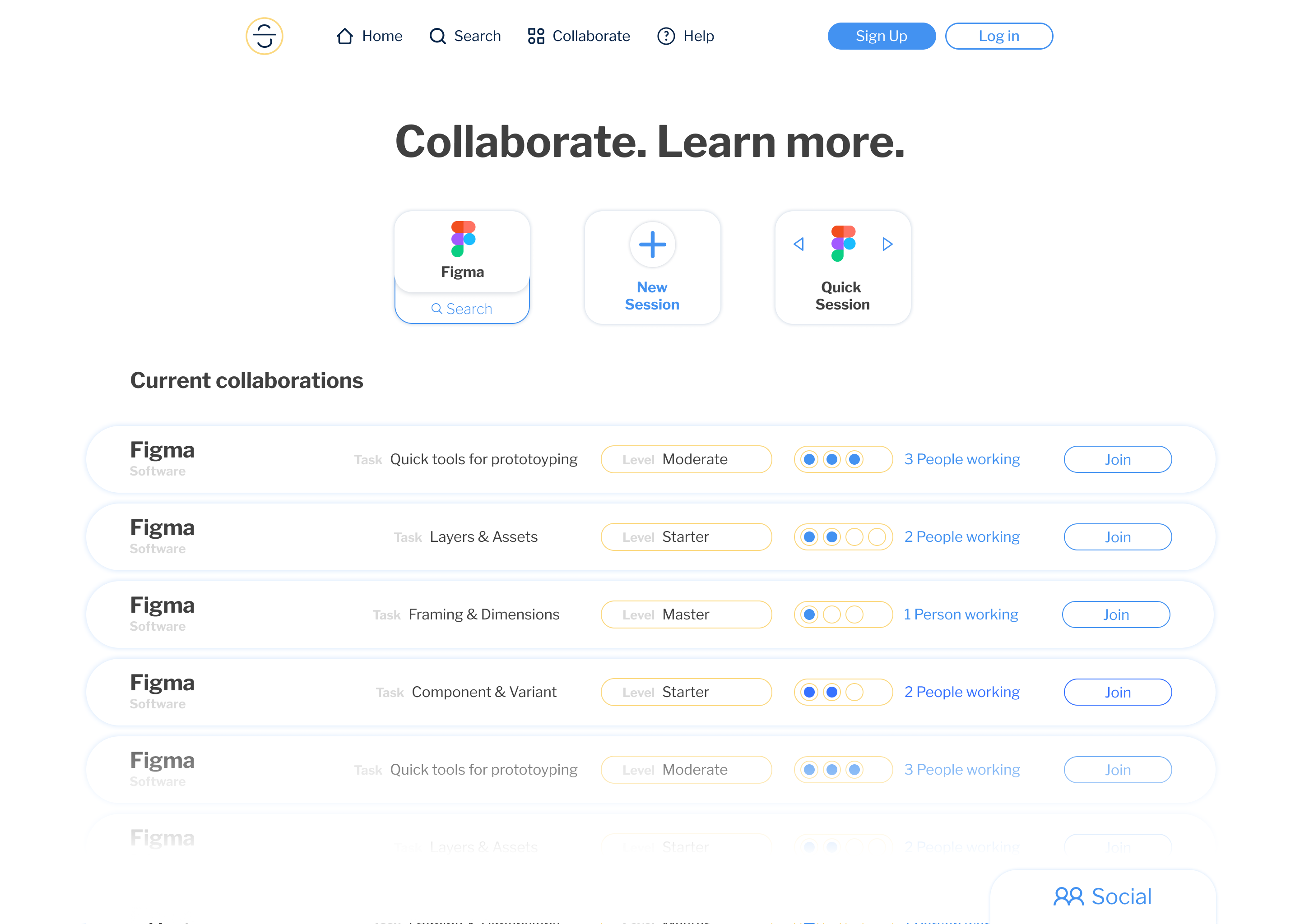
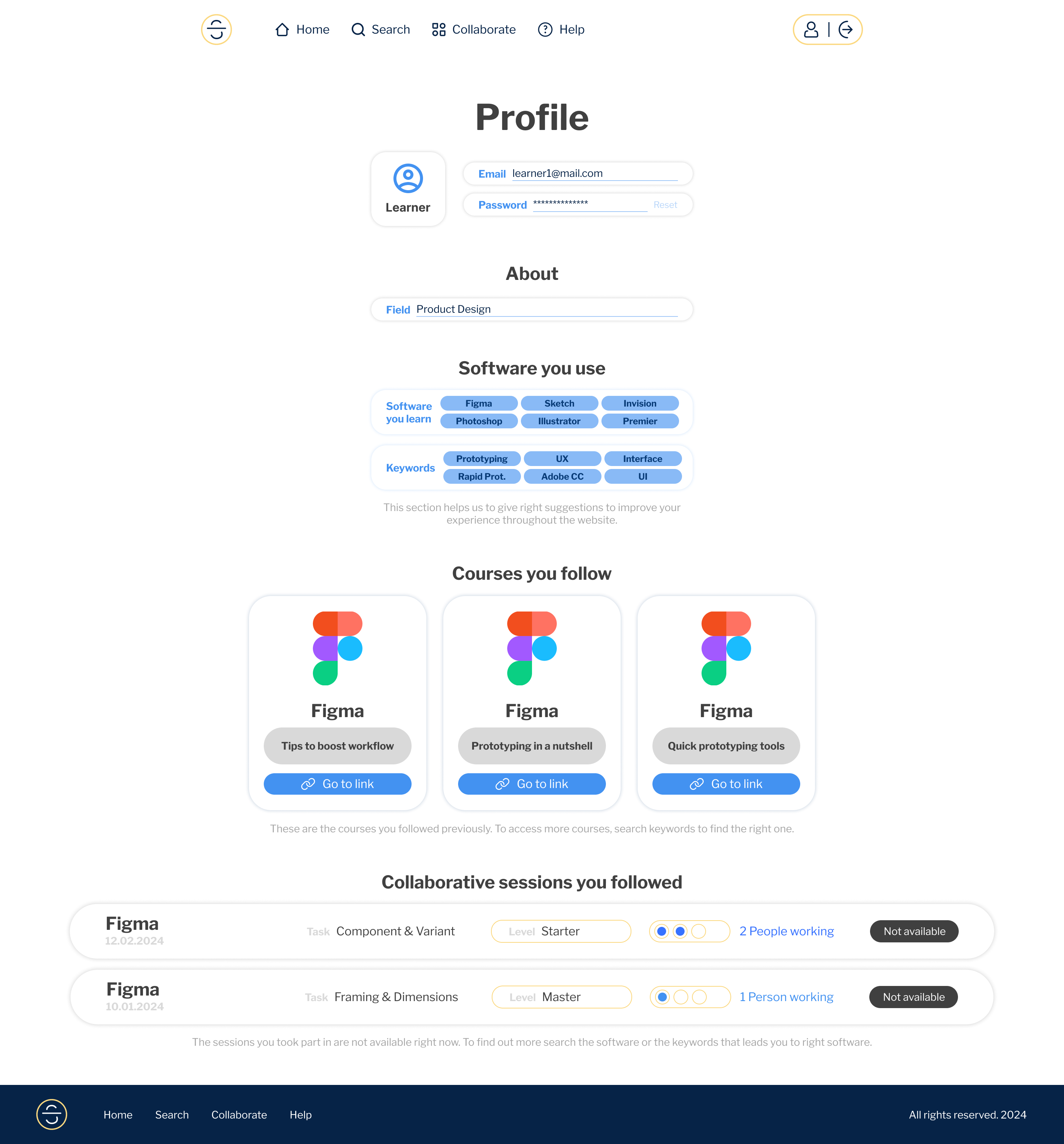
Below, I’ve summarized the journey to show how target users experience a learning process through the solution, along with the interactions between pages.
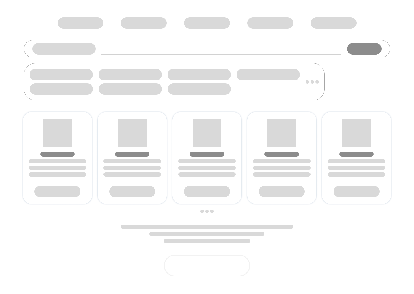
Prototype
Hi-fi mockups showcase the solution in reaching financial goals. Iterated and user-tested to polish micro-interactions & visuals.
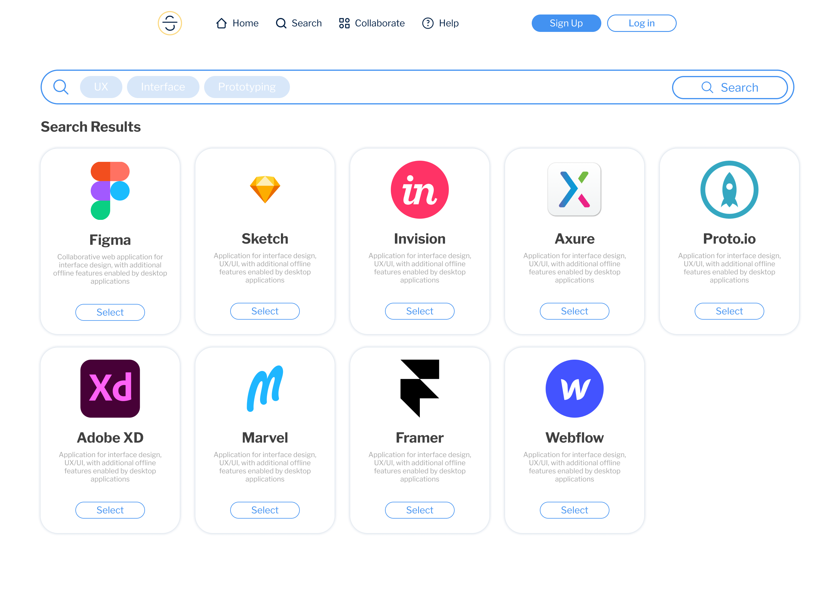
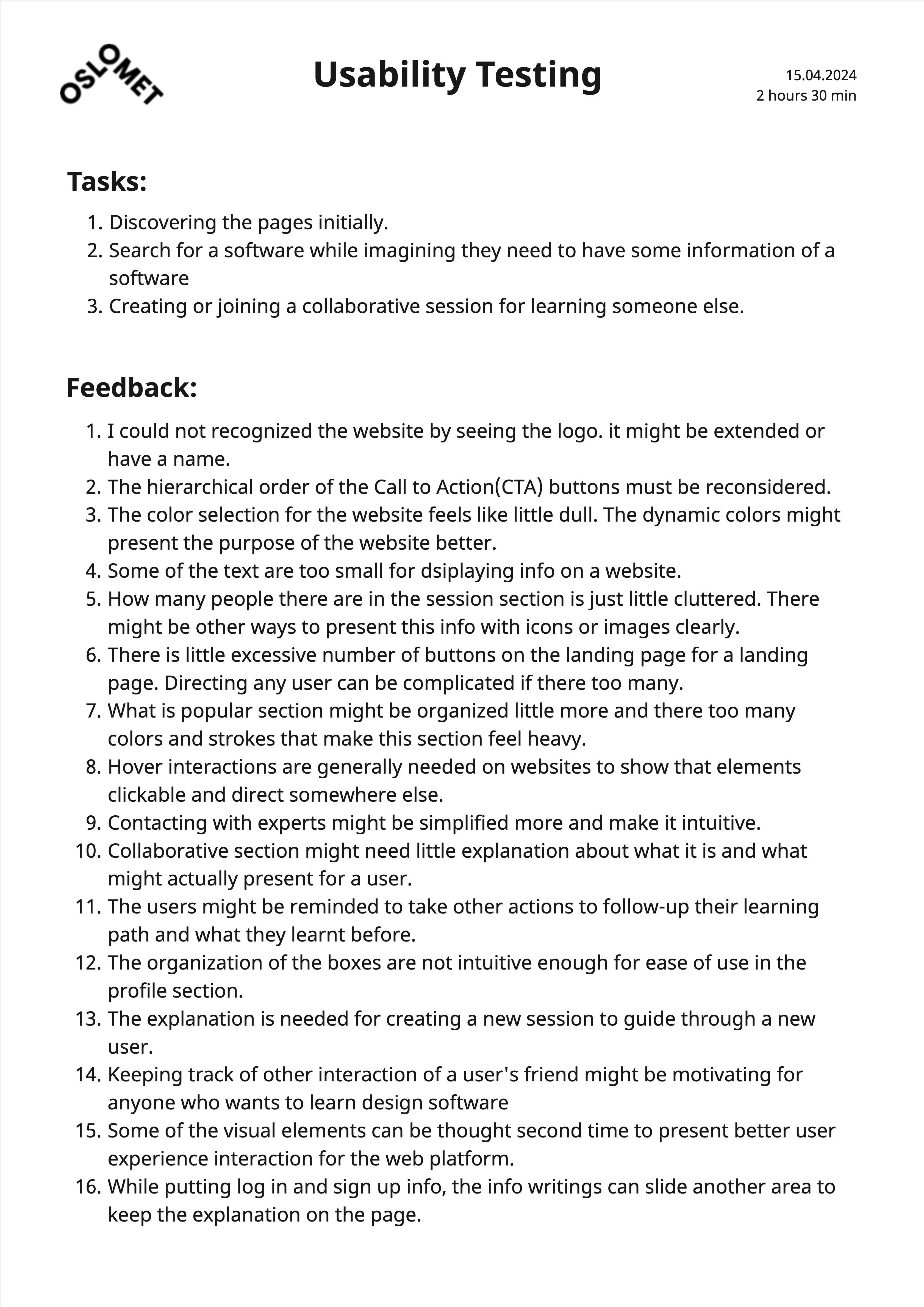
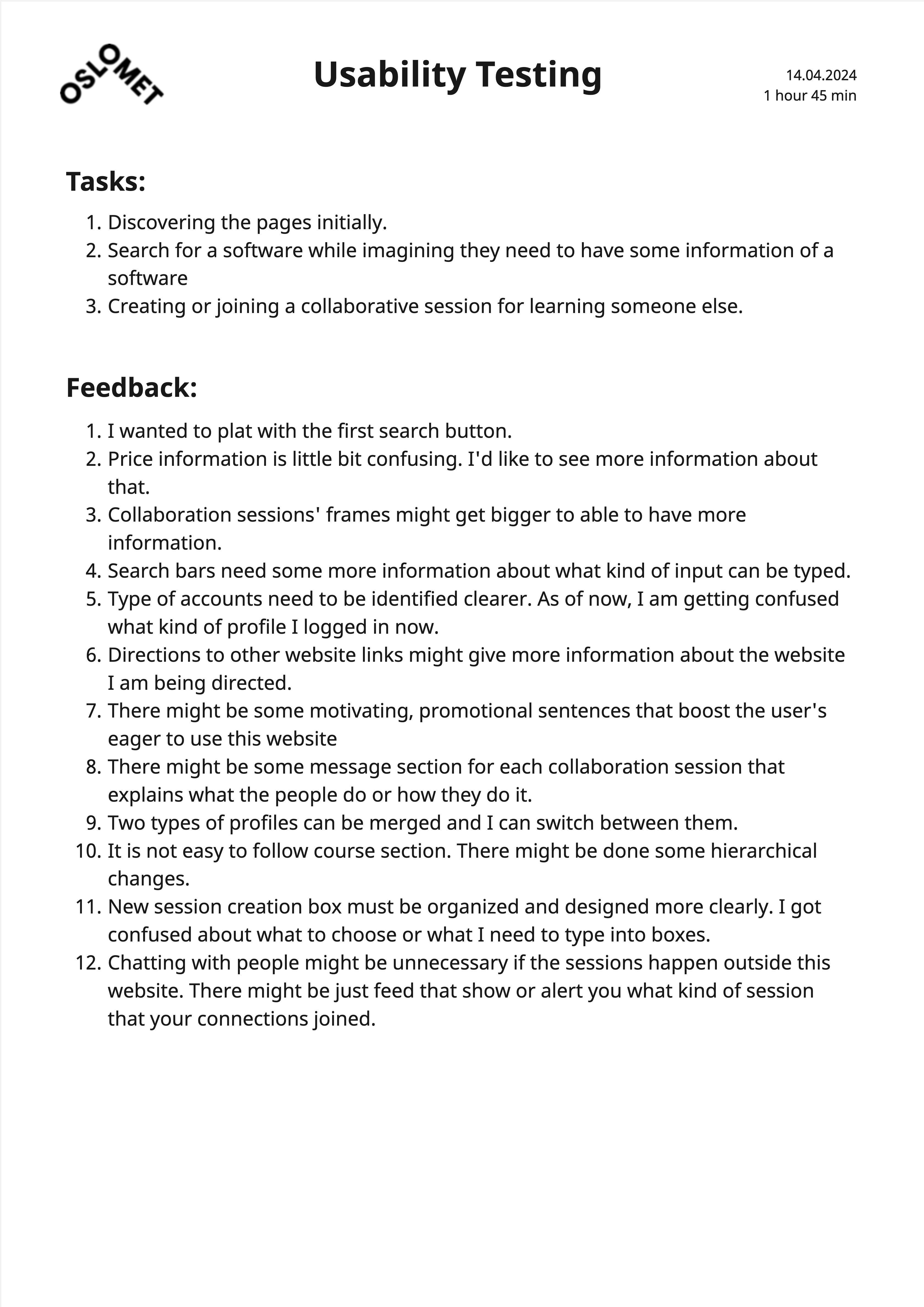
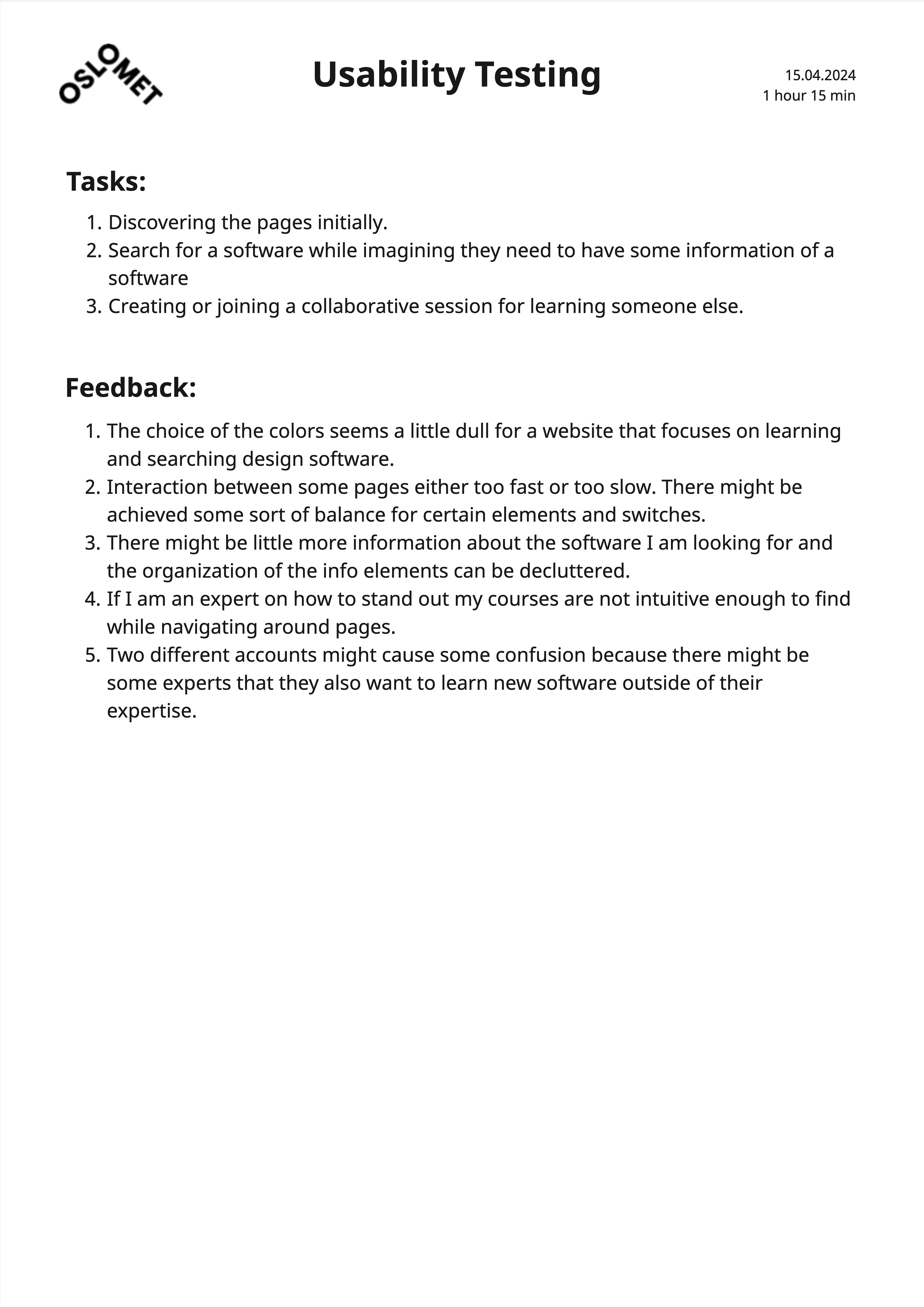
A total of three participants provided feedback on the overall user experience and design of the high-fidelity mockup. After testing the working prototype, they were asked a series of questions.
- Seeing suggestions while searching for any software is a good idea and helps me understand what kinds of software are related.
- The session system is a clever feature. Finding new people who follow the same path is much easier this way.
- It's easy to find experts in a specific field or software through this way of presenting results while searching.
- The hierarchical order of the Call to Action (CTA) buttons should be reconsidered.
- The collaborative section might need a little more explanation about what it is and what it actually provides for users.
- The number of people in the session section appears cluttered. There might be clearer ways to present this information, such as with icons or images.
Synthink’s interface uses a modern, approachable palette with soft gradients, inviting primary actions, and clean, geometric typography. Core elements are built with Plus Jakarta Sans and a clear visual hierarchy to support focus and collaborative engagement.
| Preview | Token | State | WCAG AA | WCAG AAA |
|---|---|---|---|---|
| #145AFF | color.button | Primary | PASS | FAIL |
| #FAD444 | color.button.secondary | Accent | PASS | FAIL |
| #F8F8F8 | color.background | Neutral Background | FAIL | FAIL |
| #181818 | color.text | Neutral Text | PASS | PASS |
| #757575 | color.text.secondary | Neutral Text Secondary | PASS | FAIL |
| #EAF0FF | color.background.hover | Brand Hover | FAIL | FAIL |
| #1D874C | color.affirmative | Affirmative | PASS | FAIL |
| #E51C06 | color.negatory | Negatory | PASS | FAIL |
| Preview | Token | Font weight | Font size |
|---|---|---|---|
| Headline 1 | font.headline1 | 700 / Bold | 4rem / 64px |
| Headline 2 | font.headline2 | 700 / Bold | 3rem / 48px |
| Headline 3 | font.headline3 | 700 / Bold | 2.25rem / 36px |
| Headline 3 | font.headline3.small | 700 / Bold | 1.25rem / 20px |
| Body 1 | font.body.large | 400 / Regular | 1.75rem / 28px |
| Body 2 | font.body.medium | 400 / Regular | 1.5rem / 24px |
| Body 3 | font.body.small | 400 / Regular | 1.25rem / 20px |
| Body 4 | font.body.xsmall | 400 / Regular | 1rem / 16px |
| Preview | Token | State / Description |
|---|---|---|
| button.primary.default | Default | |
| button.primary.hover | Hover | |
| button.primary.selected | Selected | |
| button.primary.disabled | Disabled | |
| button.secondary.default | Default | |
| button.secondary.hover | Hover | |
| button.secondary.selected | Selected | |
| button.secondary.disabled | Disabled | |
| button.tertiary.default | Default | |
| button.tertiary.hover | Hover | |
| button.tertiary.disabled | Disabled | |
| button.variant.warning | Warning | |
| button.variant.negatory | Negatory | |
| button.variant.affirmative | Affirmative |
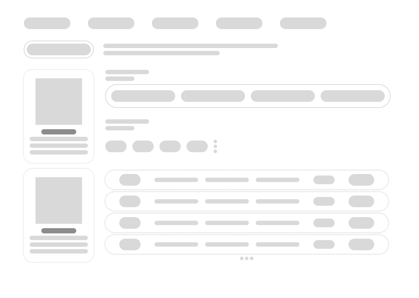
- Participants praised inline suggestions while searching so we enhanced suggestion chips with clearer labels and quick filters.
- Testers found session labels confusing so I added concise descriptions and intuitive icons to each session card.
- Users easily located experts but struggled with call to action order so we reordered primary and secondary buttons for consistency.
- Feedback on cluttered session counts led to a compact grid layout (Bento Grid) with hover details to reduce overwhelm.
- I replaced text heavy lists with categorized quick link buttons and icon driven overviews, making it easier to find related software or experts at a glance.
- Users wanted more context in the collaborative section so I introduced inline help text and tooltips for guided exploration.
In response to usability testing I refined every interaction to boost clarity and confidence so users can search, compare and connect with experts seamlessly.
In response to usability testing I refined every interaction to boost clarity and confidence so users can search, compare and connect with experts seamlessly.
Key Features of
Synthink
Reflection
Synthink started as a response to the real struggles designers face when learning new tools—navigating scattered resources, juggling multiple apps, and seeking authentic feedback. Leading this project pushed me to focus on designing for real human needs rather than just feature lists.
Surveys and interviews revealed that guided learning is only effective when paired with feedback, community, and transparent peer support. Usability testing regularly surfaced new friction points and blind spots, especially in how users approach collaboration and search for expertise. Each round of feedback forced me to rethink both interaction details and the big picture of the platform.
Prototyping with a modular approach made it possible to quickly adapt and test ideas—such as inline comments, shared sessions, and the “search & connect” flows. Building a flexible design system from the start helped keep things consistent as the platform evolved, especially with color, accessibility, and layout decisions across light and dark modes.
Most of all, I learned that social learning works best when every user can find a path that matches their own pace, style, and goals. Listening closely to both beginners and experts shaped every step of the project.
- Effective learning platforms blend personal guidance, community feedback, and easy discovery—one-size-fits-all doesn’t work.
- Iterative testing exposed surprising habits and needs that weren’t obvious from research alone.
- Small usability tweaks—like clearer labels and more focused CTAs—made a big difference in user confidence.
- Design systems save time in the long run, especially when switching between light and dark themes or testing new features.
- It’s crucial to make space for users to collaborate, share advice, and learn together, not just passively consume tutorials.
Going forward, I plan to expand usability testing to bring in more diverse participants and scenarios, including advanced learners and mentors. I want to deepen real-time collaboration tools and push the boundaries of community-driven learning. Above all, I’ll keep refining Synthink to help every user build skills with confidence and real support from others.