Categorized savings to help young people reach financial goals
Young individuals' challenges around managing a tight budget and reaching financial goals.
Provide a personalized banking feature that adapts to fluctuating monthly budgets.
Discover
Executed individual interviews with people near bank branches on-site. As a result, I collected valuable feedback and contributions from participants, which are summarized in four main points as follows:
- Students lack confidence in managing variable monthly budgets and often avoid reviewing their spending.
- Most users are overwhelmed by the complexity and number of steps required to set up savings.
- Many participants express confusion about financial terms and options, which blocks progress.
- The “set and forget” approach leads to little engagement and missed savings opportunities.
- High fees and hidden charges discourage users from using advanced features or investing.
- Mobile apps often push irrelevant offers and notifications, creating distraction instead of value.
- Difficulty linking and managing multiple bank accounts or external services in one place.
- Security and privacy concerns make users hesitant to try new digital banking solutions.
- Limited customer support and slow response times frustrate users when problems arise.
- Sustainable and ethical banking options are still hard to identify or access for younger users.
Young people need help the most. Adults rely on traditional saving methods passed down by their parents and their steady income, while students struggle to manage finances and adapt to modern banking.
Young people need help the most. Adults rely on traditional saving methods passed down by their parents and their steady income, while students struggle to manage finances and adapt to modern banking.
Analyzed recent banking, financial struggles, and facilitate opportunities for enhancement.
I then focused on monitoring the three most commonly used banking applications in Norway. This allowed me to synthesize their solutions and features, helping me prioritize key decisions during the ideation and prototyping stages to enhance the user experience.
- All three apps have adopted digital banking features well, but none deliver a savings experience tailored specifically for young users’ real needs.
- The Norwegian design approach prioritizes clarity and simplicity, but this sometimes leads to oversimplified flows that miss opportunities for helpful guidance.
- Despite their clean structure, the apps show inconsistencies in navigation and visual cues, which can confuse new users.
- SpareBank 1 stands out for visualizing savings progress, but overall, progress tracking and goal-setting could be much more engaging and actionable.
- Most importantly: Students need intuitive, flexible tools that adapt to their unpredictable incomes, not just stripped-down versions of adult banking features.
Young people need more support and flexibility from their banks. Unlike adults, students face unpredictable budgets and must learn financial management from scratch. This is the real opportunity for a new approach to savings.
Young people need more support and flexibility from their banks. Unlike adults, students face unpredictable budgets and must learn financial management from scratch. This is the real opportunity for a new approach to savings.
Empathize
After thoroughly investigating the problem and considering earlier findings, a draft journey map was created to outline the user steps.

- Confusing methods of saving up on mobile applications.
- Difficult configurations for any savings account.
- An emergency budget for contingent situations.
- Saving up for monetary goals such as needs and hobbies.
After thoroughly investigating the problem and considering earlier findings, a draft journey map was created to outline the user steps.
- Limited budget
- No incentive
- No attachment
- Losing interest
- Lost potential
- Young users like Camilla start out seeking financial stability, but often feel lost among too many confusing options with little personal guidance.
- Most apps provide generic saving features, but rarely offer incentives or motivation that actually help users build lasting habits.
- The initial excitement quickly fades—unclear processes, lack of support, and hard-to-configure accounts lead to users abandoning their saving goals.
- Emotional ups and downs define the journey: users try, lose motivation, and give up when tools aren’t designed around their unique needs and pains.
- What’s missing is a truly supportive experience: real-time nudges, clearer steps, and flexible tools that adapt to unpredictable budgets and changing goals.
Introducing a novel personalized saving method not only fosters financial awareness in young individuals but also makes their saving journey more insightful and engaging.
Introducing a novel personalized saving method not only fosters financial awareness in young individuals but also makes their saving journey more insightful and engaging.
Ideate
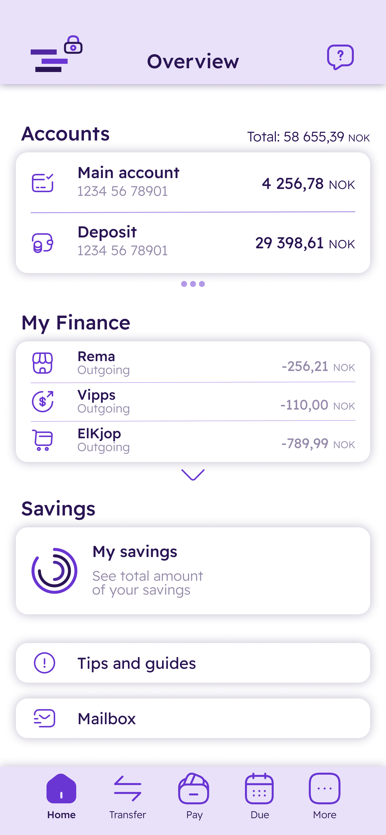
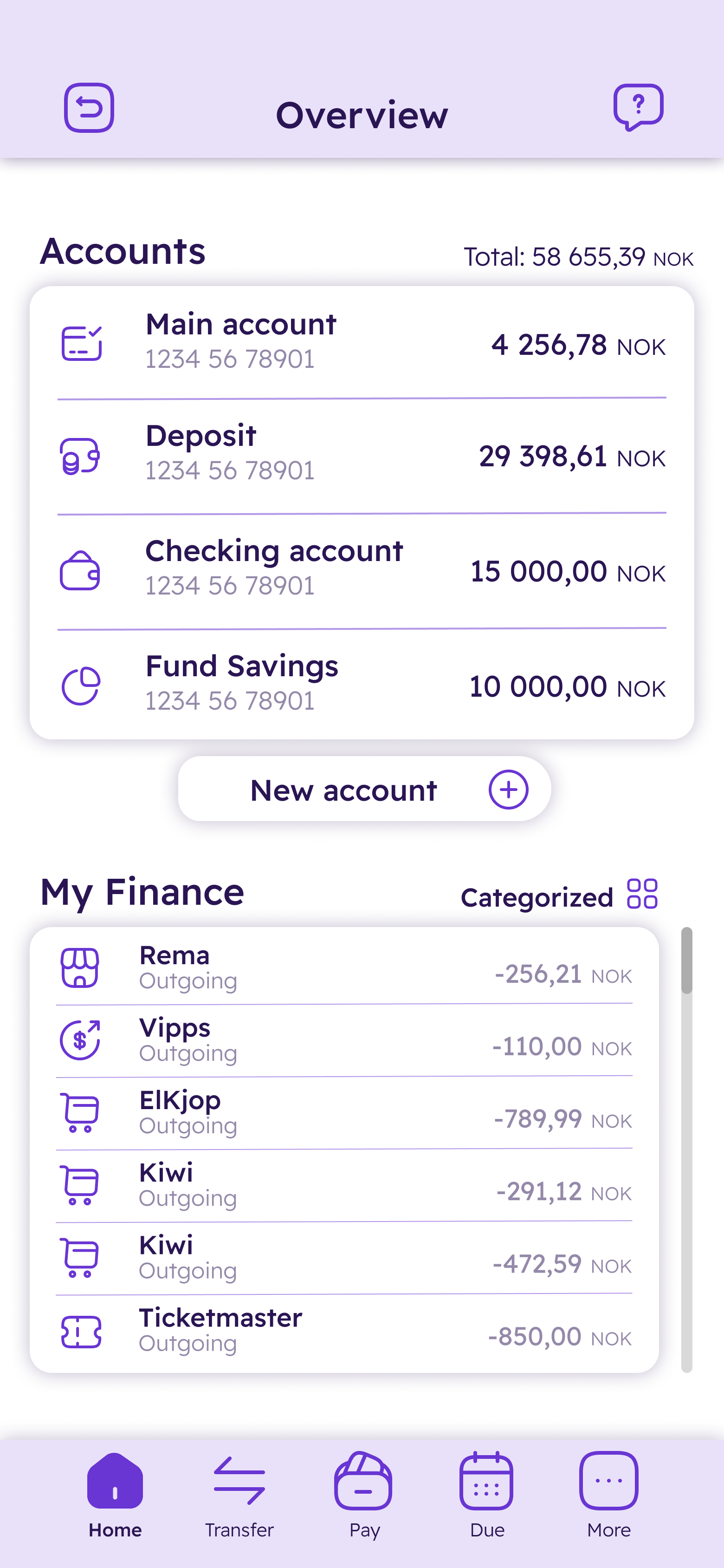
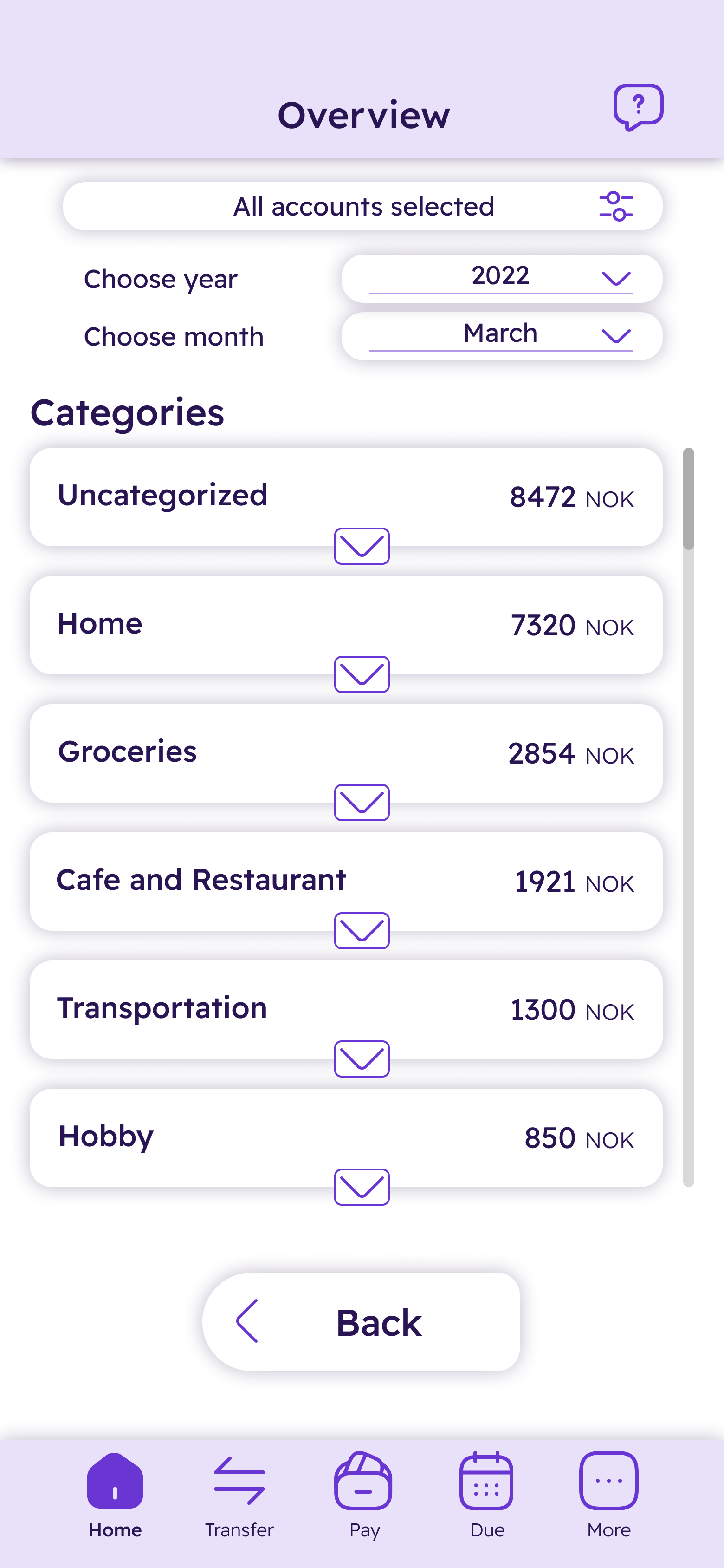
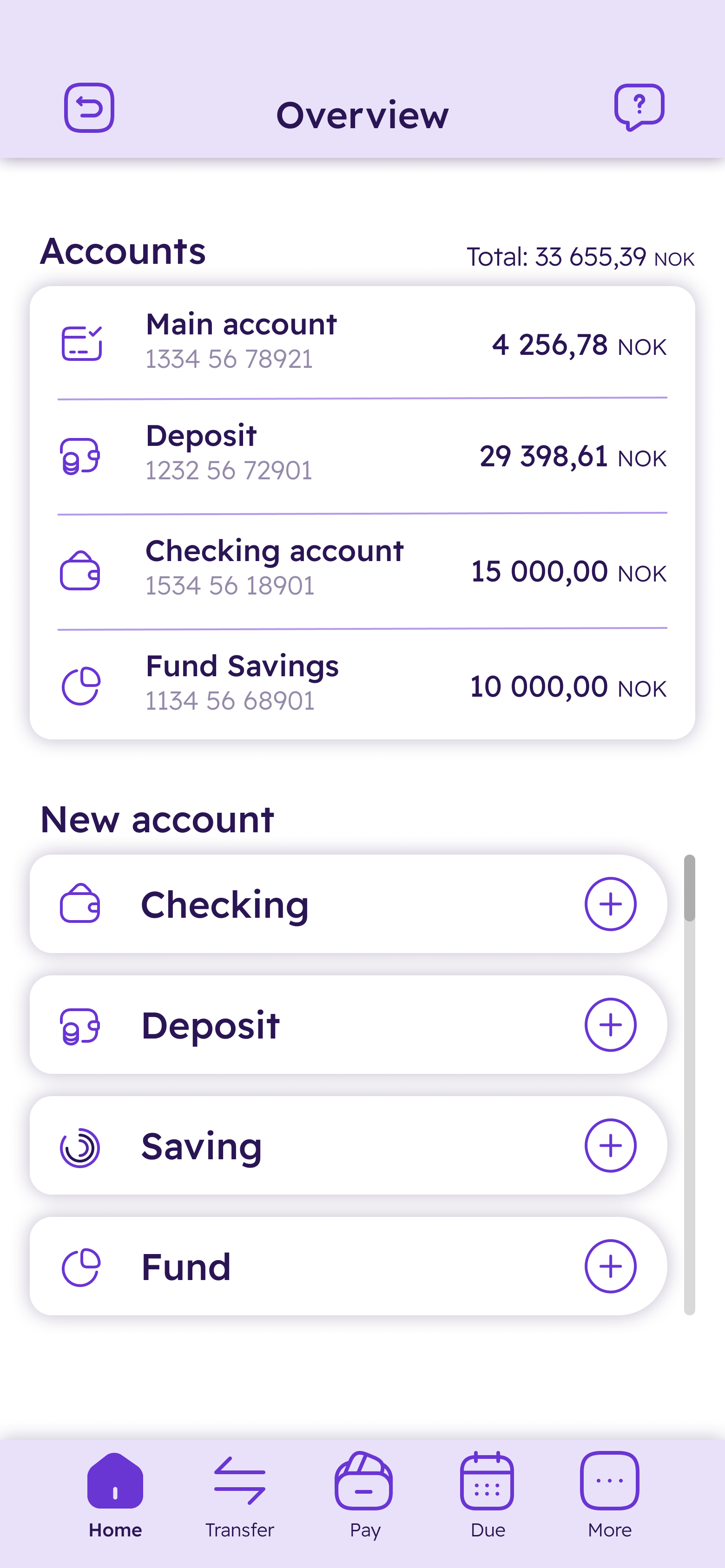
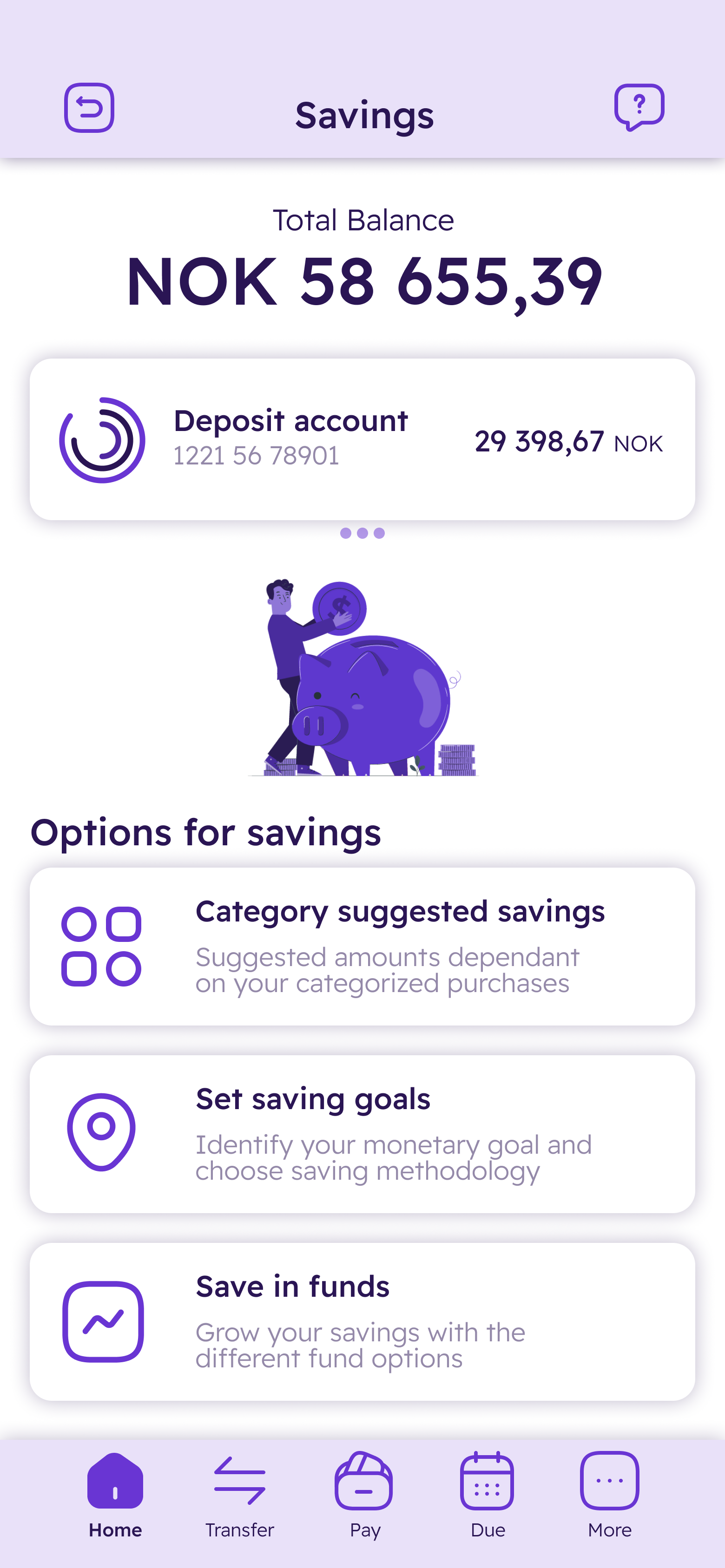
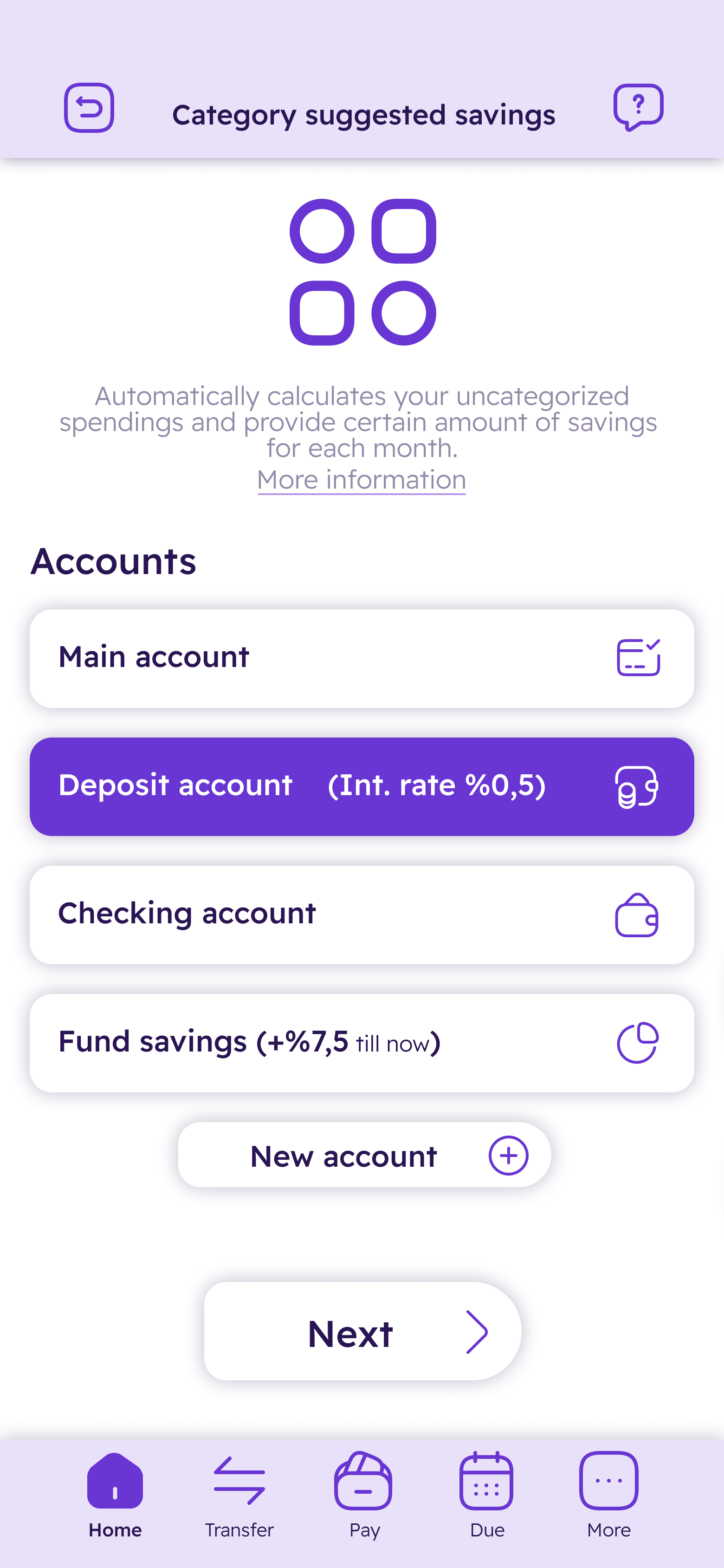
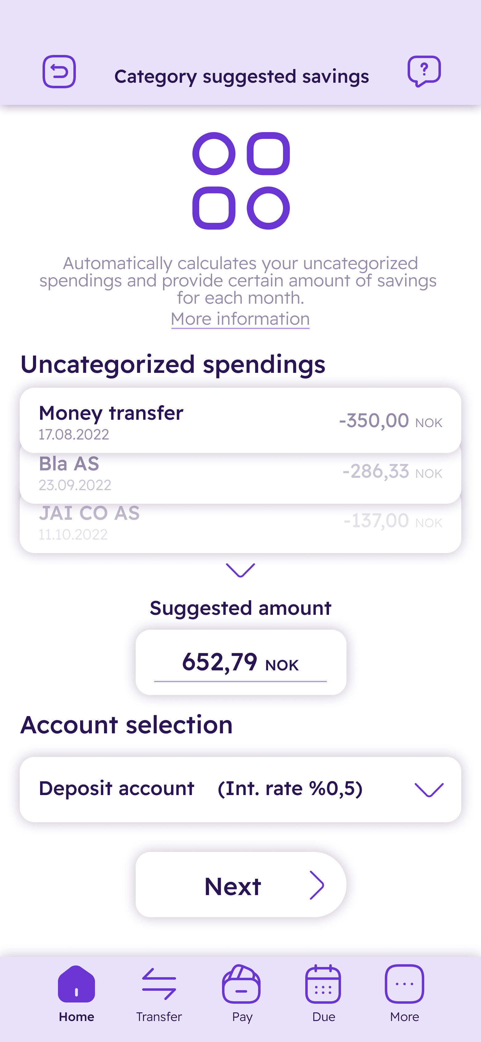
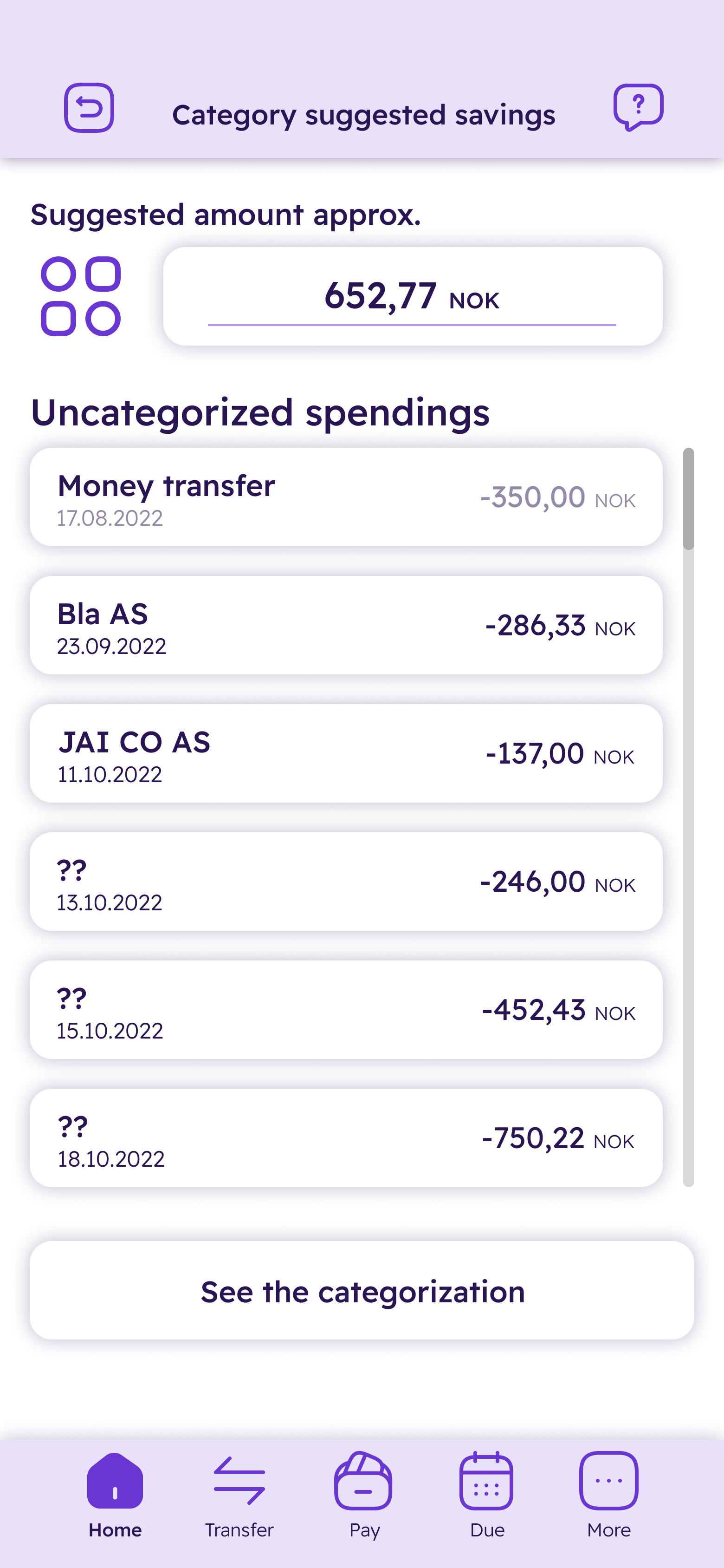
Dense variety of wireframes sketched out to map essential steps of the potential savings options in an understandable way. This helped me comprehend how a user follow steps and execute the task effortlessly. Below are five organized steps to activate the novel categorized saving feature.
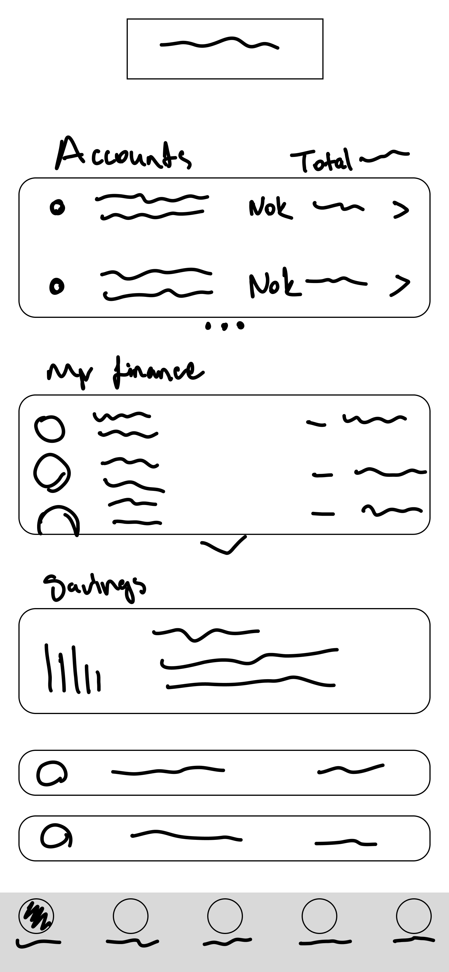
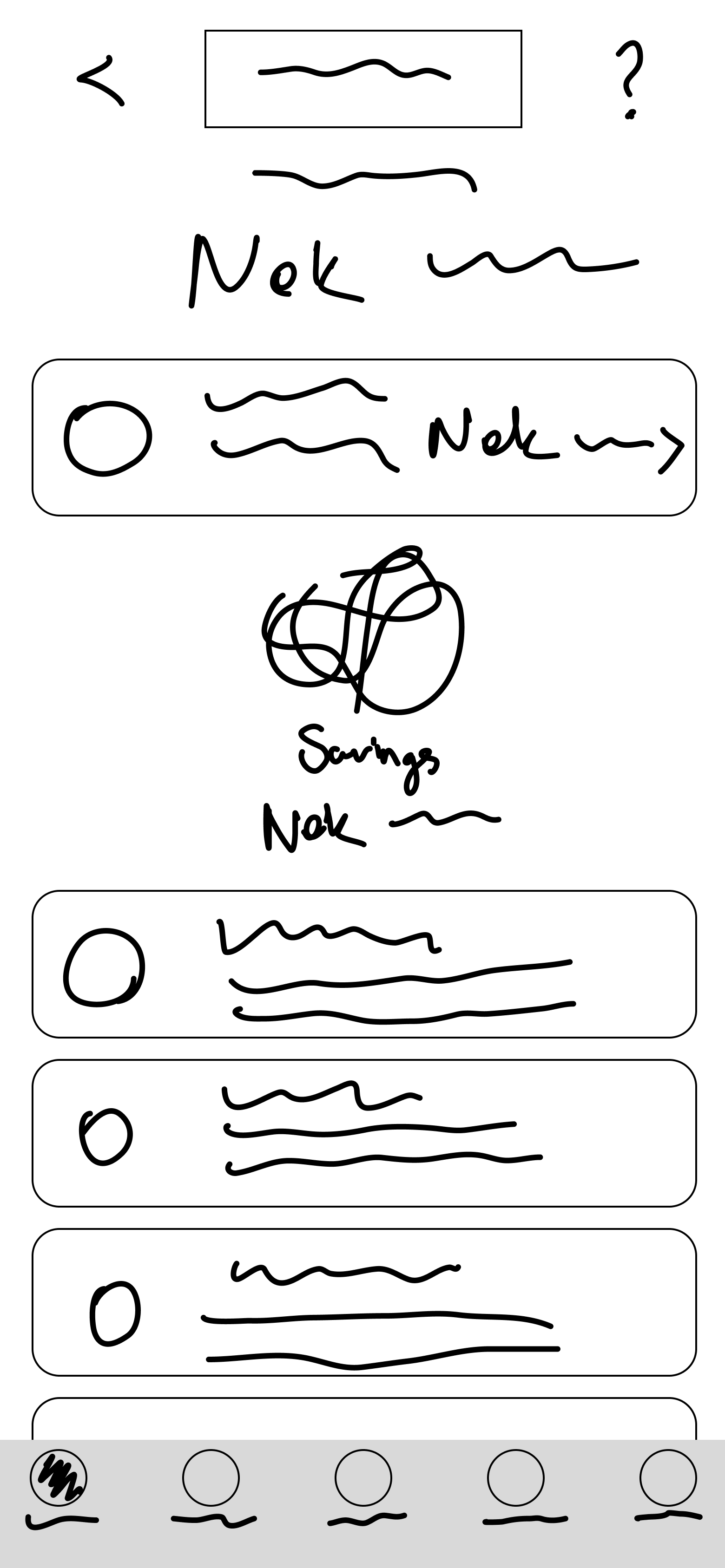
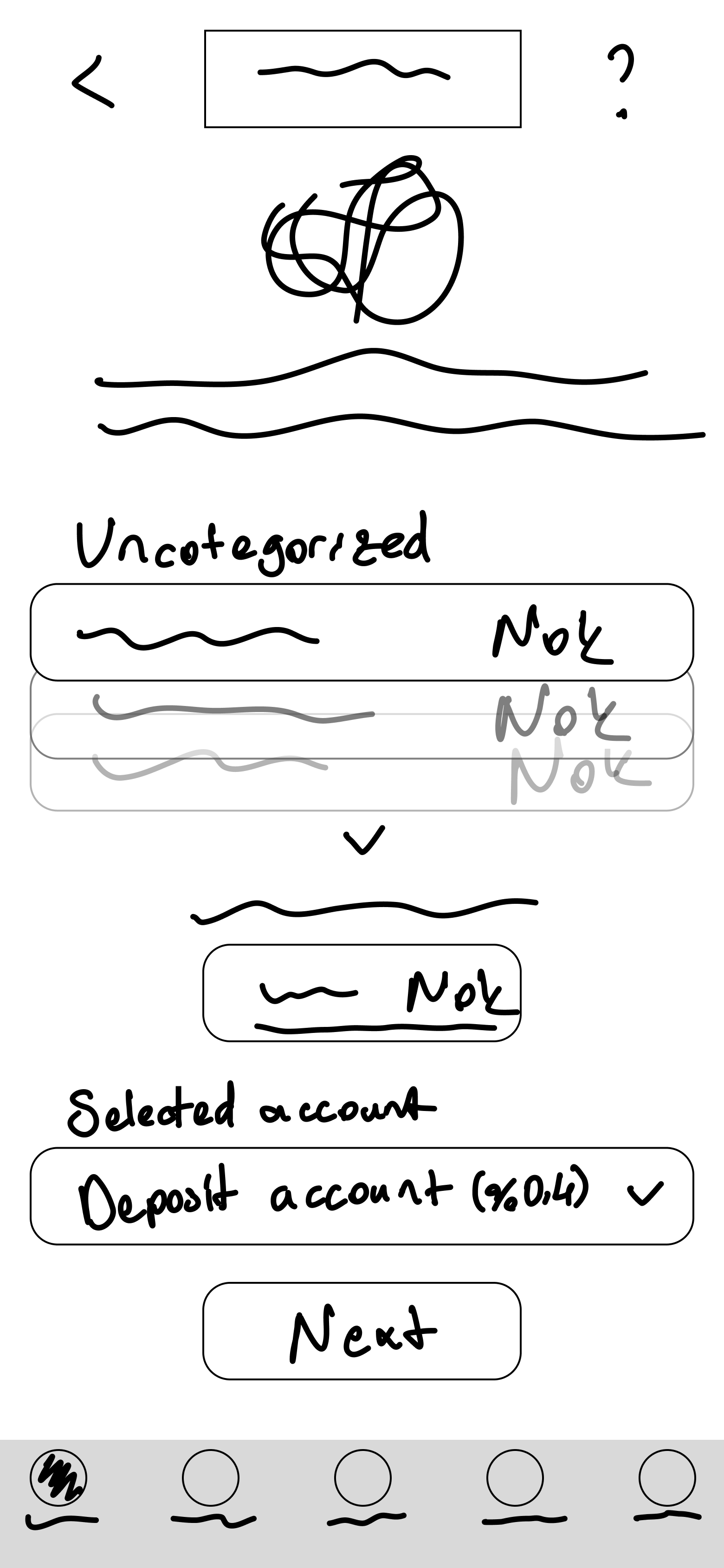
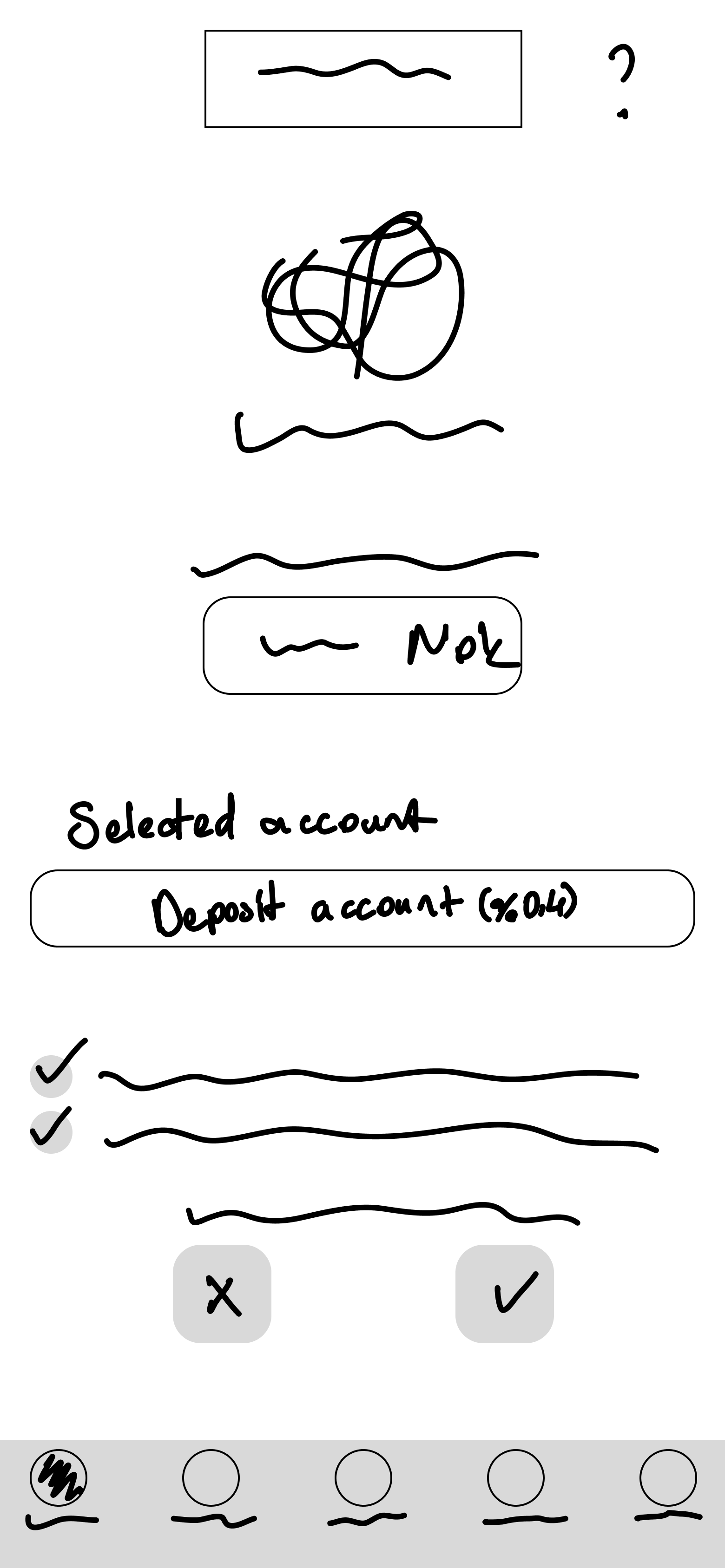
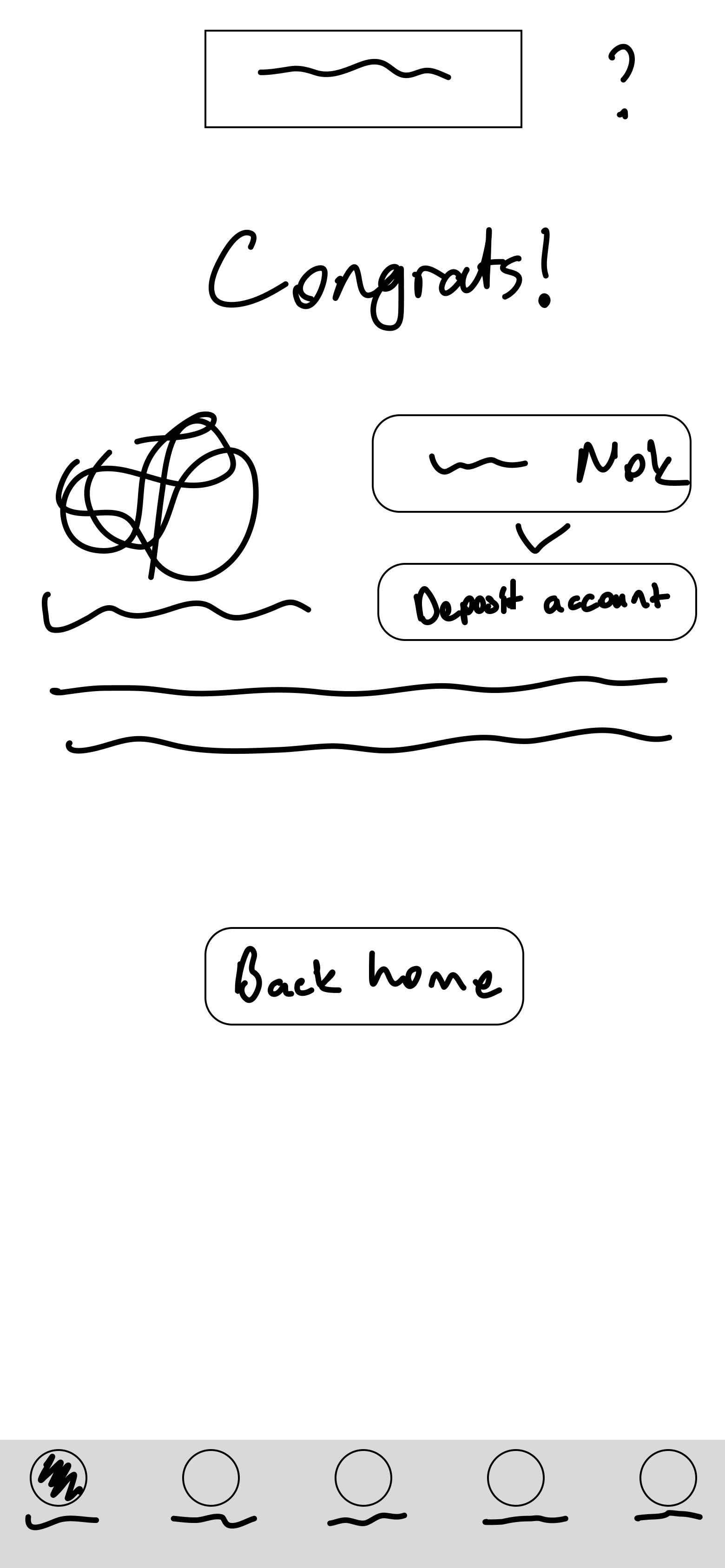
Information architecture helped me to create a consistent structure for the banking app to effectively position the feature.
Example search
Accounts
Documents
Inbox
Notifications
Appearance
Log out
Amount
Due
Note
Repeat
International
Qr code
Approve (Summary / Send)
Subscriptions
Create new
Prioritized
Flow maps were made to make and prioritize tasks around the feature, visually structuring its steps in a user-centered approach.

Prototype
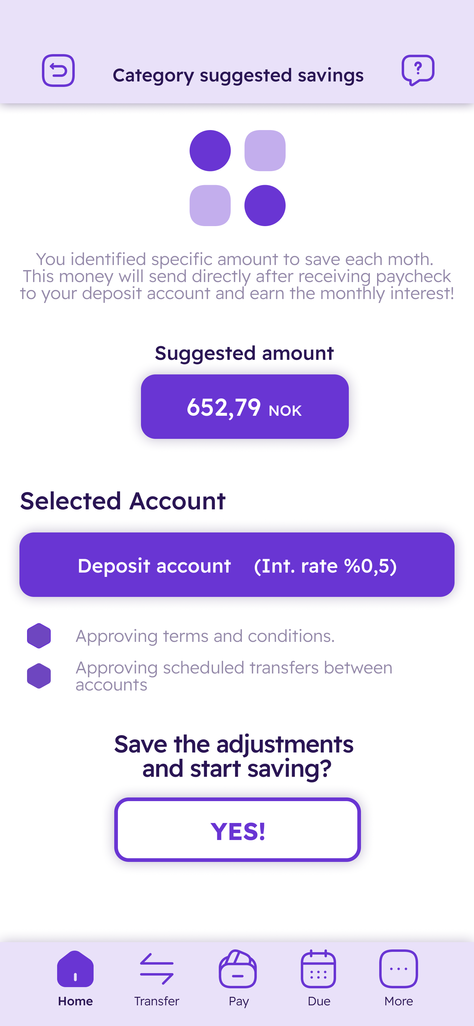
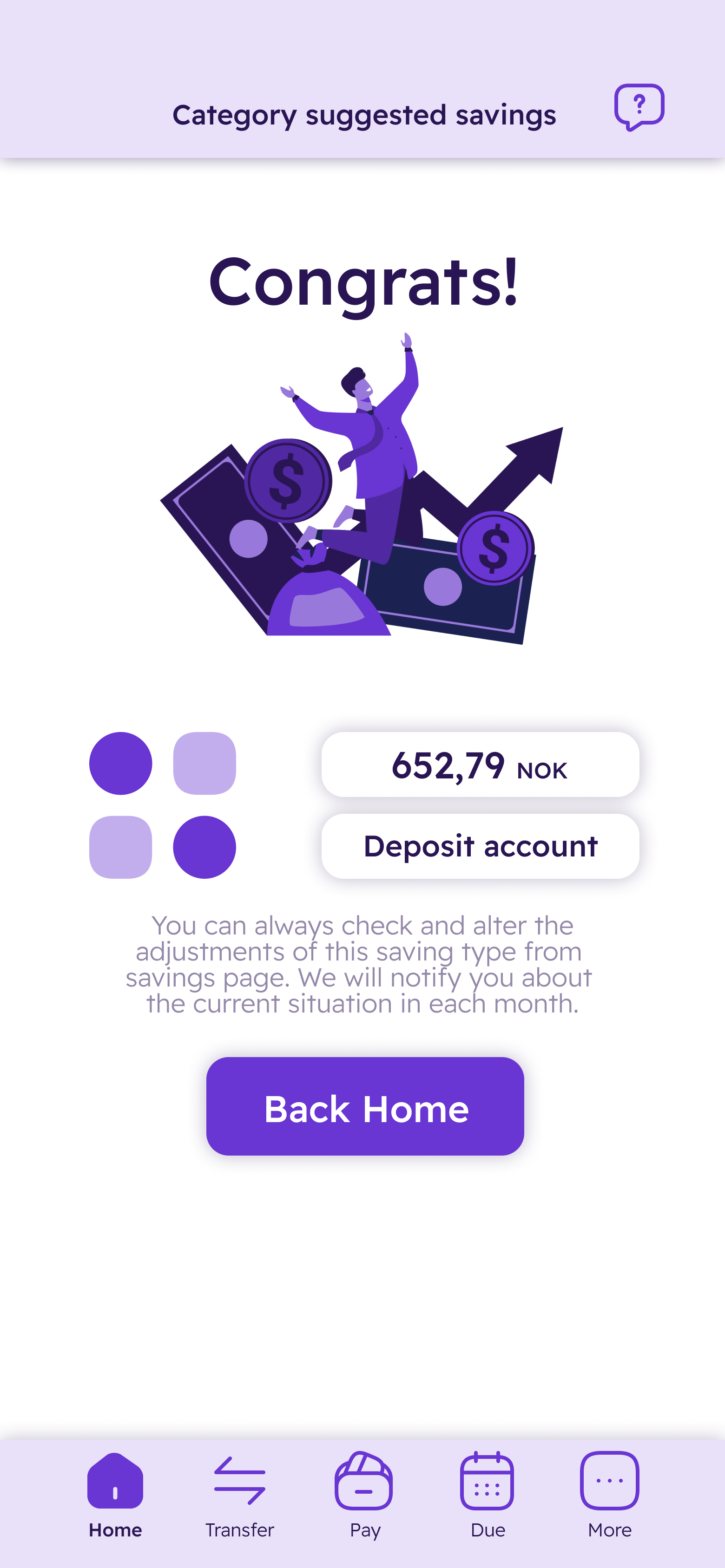
Hi-fi mockups showcase the solution in reaching financial goals. Iterated and user-tested to polish micro-interactions & visuals.
I conducted a usability test with three participants from the same user group, using the wireframes to assess the effectiveness of the design and the overall user experience.
- The organization of the elements feels clean on each page, which helps me understand the steps I need to follow.
- It is easy to track the different tabs and features on every page, even during the process of creating a new account.
- Categorizing each spending and turning it into a feature is a great idea. This also makes it easier to track my finances.
- The details of the icons and visuals on different pages distracted me from what I was planning.
- The background shadow is quite distracting and gives the tabs and groups a less clean look.
- While progressing on certain tasks, the changes are quite massive, which gives me a feeling of insecurity.
Catesave’s UI uses a modern, friendly palette with gradients, bold primary actions, and clean, geometric typography. Core elements are built with Plus Jakarta Sans and clear visual hierarchy for financial confidence.
| Preview | Token | State | WCAG AA | WCAG AAA |
|---|---|---|---|---|
| #9E23D2 | color.button | Brand Identity | PASS | FAIL |
| #9E23D2, #D42B2B | color.tab | Accent 1 | PASS | FAIL |
| #9E23D2, #FFFFFF | color.progress | Accent 2 | FAIL | FAIL |
| #030303 | color.text | Neutral Text | PASS | PASS |
| #6F6F6F | color.text.secondary | Neutral Text Secondary | PASS | FAIL |
| #AAAAAA | color.icon | Neutral Icon | FAIL | FAIL |
| #F6F6F6 | color.background | Neutral Background | FAIL | FAIL |
| Preview | Token | Font weight | Font size |
|---|---|---|---|
| Headline 1 | font.heading.large | 600 / Semibold | 1.25rem / 20px |
| Headline 2 | font.heading.medium | 600 / Semibold | 0.875rem / 14px |
| Body 1 | font.body.large | 400 / Regular | 0.875rem / 14px |
| Body 2 | font.body.medium | 400 / Regular | 0.75rem / 12px |
| Body 3 | font.body.small | 400 / Regular | 0.625rem / 10px |
| Body 4 | font.body.xsmall | 400 / Regular | 0.5rem / 8px |
| Preview | Token | State / Description |
|---|---|---|
| button.primary.default | Default | |
| button.primary.selected | Selected | |
| button.primary.disabled | Disabled | |
| button.primary.loading | Loading | |
| button.secondary.default | Default | |
| button.secondary.selected | Selected | |
| button.secondary.disabled | Disabled | |
| button.secondary.loading | Loading | |
| button.tertiary.default | Default | |
| button.tertiary.selected | Selected | |
| button.tertiary.disabled | Disabled | |
| button.tertiary.loading | Loading | |
| button.variant.warning | Warning | |
| button.variant.danger | Danger | |
| button.variant.discovery | Discovery |
- Early high-fidelity prototypes revealed the tension between feature richness and keeping things simple. I chose to surface only essential info, using strong visual hierarchy to make core actions obvious and minimize cognitive load.
- Instead of copying generic savings flows, I focused on building motivation into the experience—features like customizable saving percentages and dynamic feedback to nudge users at the right time.
- Every visual and UI element was evaluated for clarity and usability. Through iterative user testing, I simplified interactions and removed steps that slowed down the process or confused first-time users.
- Design system choices were guided by accessibility and brand: bold colors and gradients for focus, but plenty of neutral space to avoid overwhelming the interface.
- A core decision was to make everything personal—users should feel in control and supported. Settings for saving behavior, flexible categories, and clear progress indicators were designed to give young users agency and reduce frustration.
- Usability testing was crucial for spotting what didn’t work. Feedback led to adding a new “percentage saved per category” feature and reworking the savings overview to be more visual and less text-heavy.
In the end, every design decision came down to a single principle: make saving feel approachable, empowering, and truly tailored to real financial behaviors. Catesave’s design system and interactions reflect this, bringing together clean structure with enough flexibility for real-world needs.
In the end, every design decision came down to a single principle: make saving feel approachable, empowering, and truly tailored to real financial behaviors. Catesave’s design system and interactions reflect this, bringing together clean structure with enough flexibility for real-world needs.
Key Features of
Catesave
Reflection
This project really showed me what it means to design for real people, especially young users navigating complicated financial lives. I realized you have to go much deeper than surface-level research. Gaining genuine insight only happens by actively listening, understanding everyday frustrations, and questioning my own assumptions throughout the process.
Building prototypes and running tests taught me that features matter only when they solve real problems in real situations. Watching users interact with early versions gave me a better sense of what actually makes a difference—things like clarity, simplicity, and encouraging feedback. I also discovered that a well-designed experience can turn uncertainty into motivation if you make the path clear and supportive.
The process also reminded me how important it is to stay flexible and open to change. Every round of testing opened up new perspectives, often pointing out things I had missed before. Setting up a consistent design system kept everything aligned but still left room for improvements as the product took shape.
- Listening to real users and gathering direct feedback is essential because it always uncovers blind spots, no matter how well you plan.
- Financial tools for young people need to be adaptive, visual, and easy to personalize. They should not just copy what works for adults.
- Trust and engagement grow when users feel supported rather than judged as they manage their finances.
- Design is never finished. Staying open to feedback and ready to iterate always leads to a better result.
Looking ahead, I want to bring in stronger guidance and give users even more helpful financial insights. I plan to expand user testing to include a more diverse group, explore new ways to motivate positive saving habits, and make sure Catesave continues to evolve alongside real user needs.